Radford Wallis
Established in 1999, Radford Wallis was founded with a clear intention: to produce memorable and engaging work that combined original thinking with exceptional craft. The agency worked across multiple disciplines, including print, digital, and physical experiences. Recognised for its creative excellence, Radford Wallis received numerous awards and was ranked among the UK’s most creative agencies.
Key clients included:
Aviva Group
Balfour Beatty plc
Breakthrough Breast Cancer
British Heart Foundation
British Land plc
D&AD
Design Council
English Touring Theatre
Institute for Cancer Research
Land Securities plc
Media Guardian Edinburgh International Television Festival
The National Brain Appeal
National Maritime Museum
NHS
Oxford Brookes University
Prince’s Trust
Ravensbourne College of Design & Communication
Royal Choral Society
Sense International
Sodexo plc
Ted Baker
Yahoo!
Andrew Wallis
Land Securities
Land Securities, a leading UK commercial property developer, shaping the urban landscape with its office, retail, and mixed-use developments. Known for creating iconic and architecturally significant buildings, it plays a key role in transforming London’s skyline through innovation and placemaking.
In 2005, Radford Wallis was selected as one of the lead agencies on the Land Securities roster, alongside esteemed studios such as Hat-Trick, WMH, NB Studio, Purpose, 300 Million, The Chase, and Together. Over the course of the collaboration, Radford Wallis developed various marketing campaigns for some of Land Securities’ most prestigious buildings and developments, including the ‘Walkie Talkie’ building at Twenty Fenchurch Street, designed by Rafael Viñoly. One of their most notable campaigns, 16 Palace Street, won three D&AD Pencils.
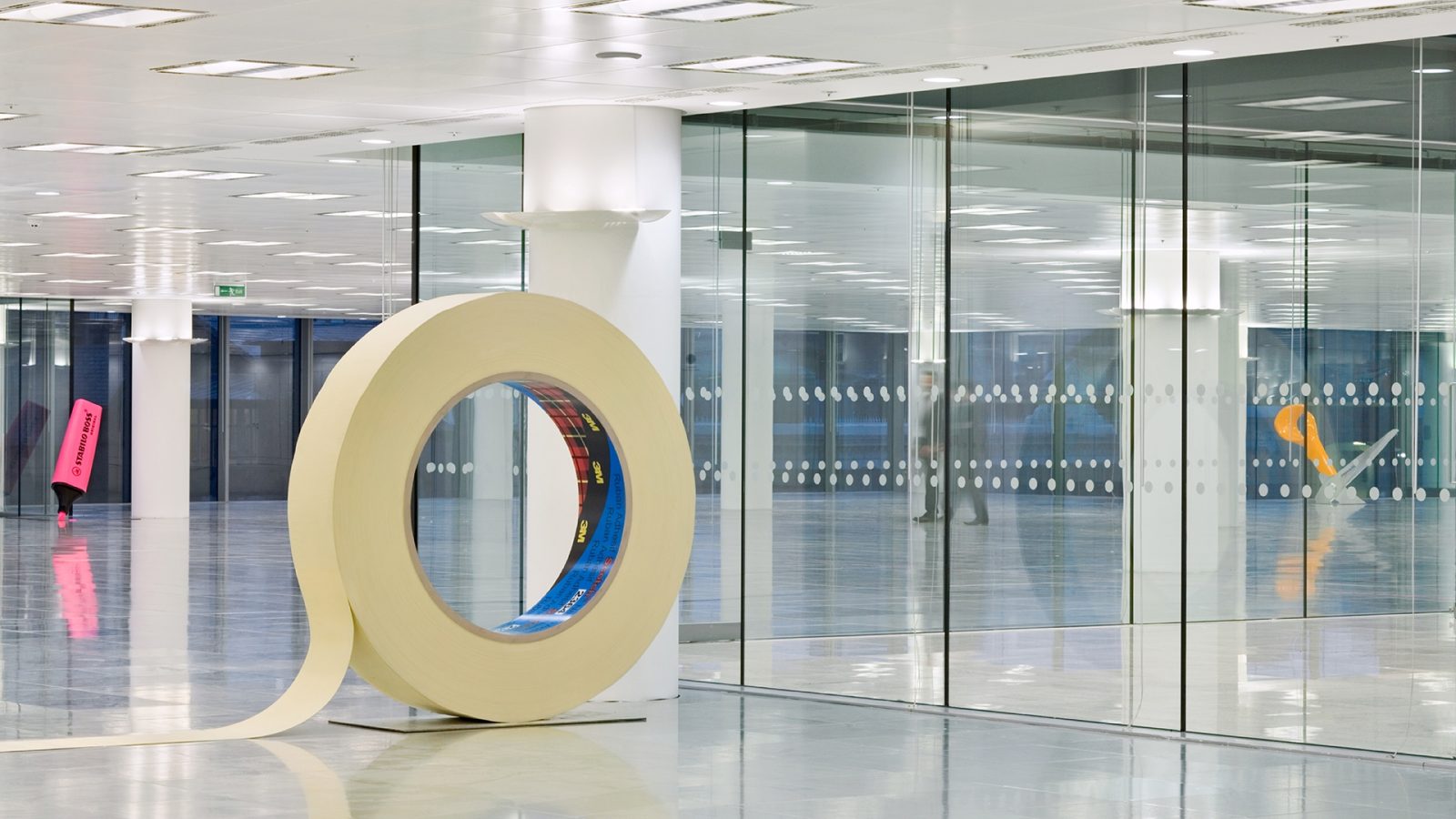
80 Victoria Street – Large Objects
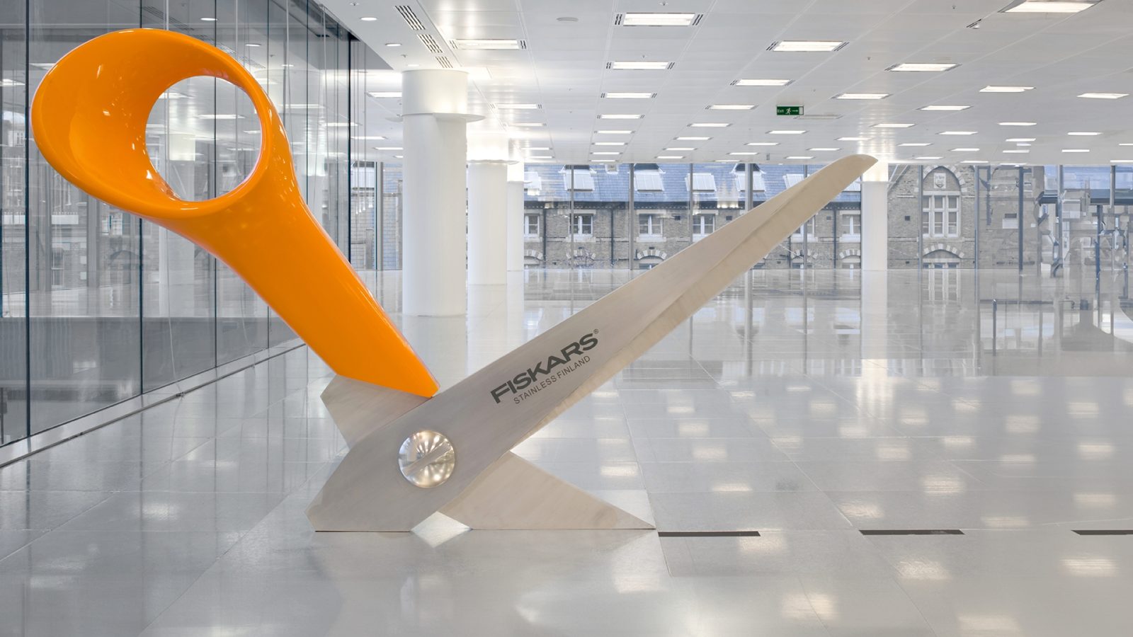
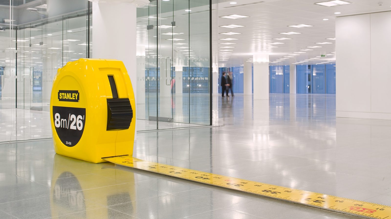
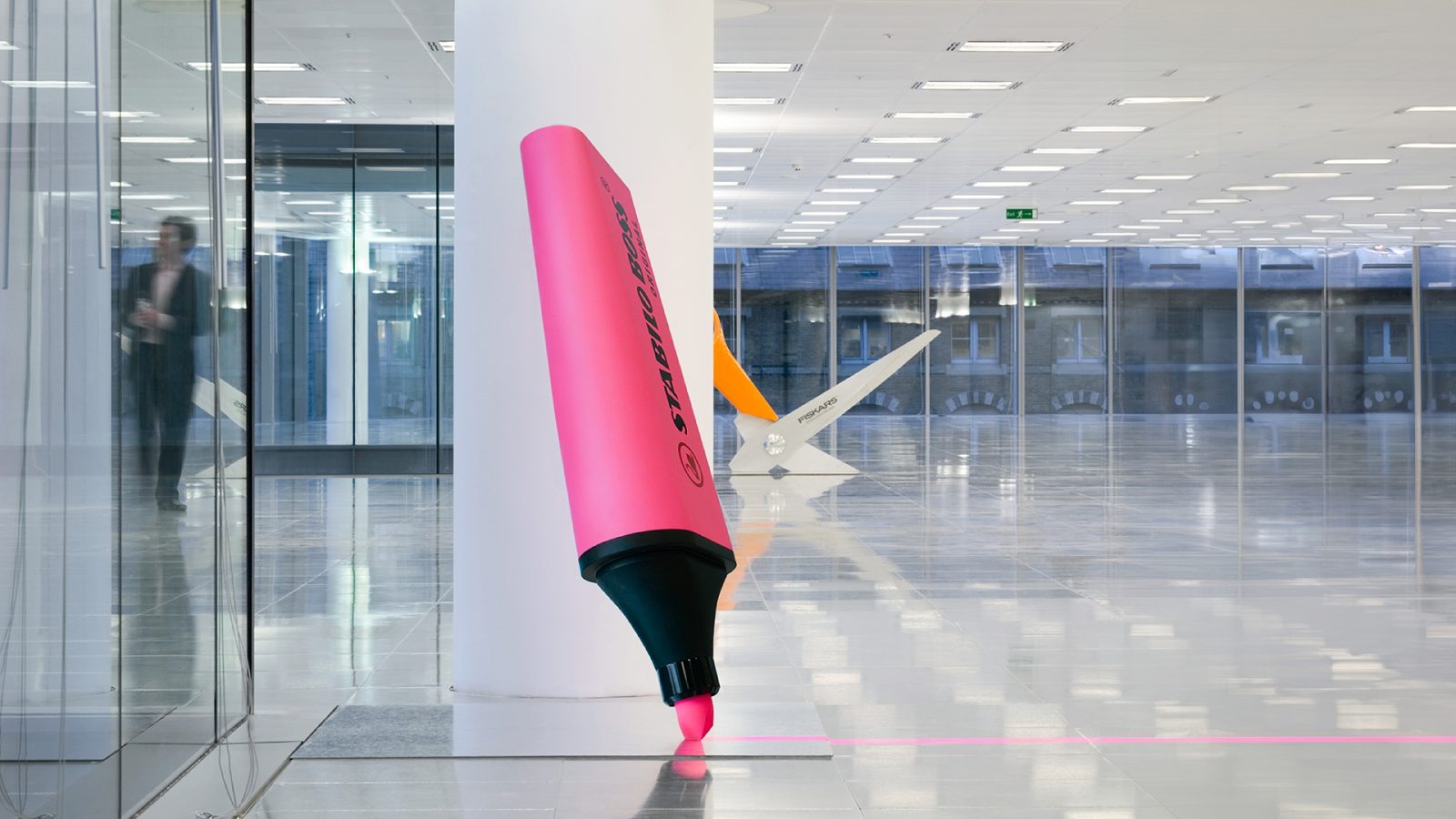
80 Victoria Street, the largest part of Land Securities’ Cardinal Place office development in London SW1, required a creative solution to demonstrate its future division into four smaller sections. The standard approach in the property sector would typically involve using different coloured carpet tiles to mark each section. However, Land Securities sought a more unique and memorable solution for this prime office space.
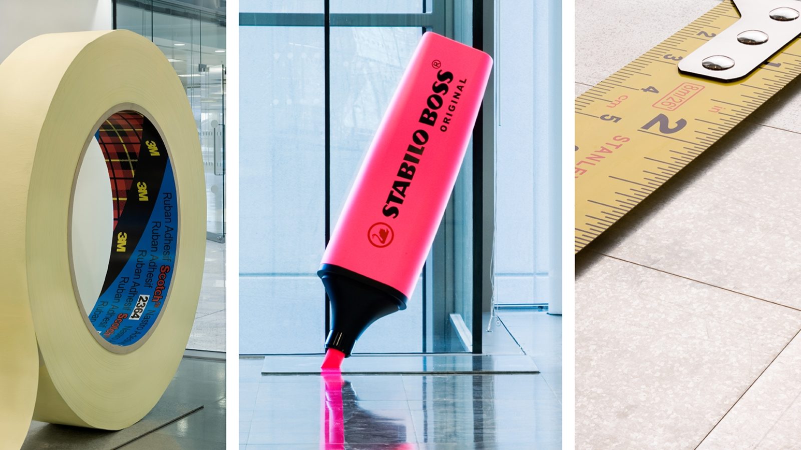
To help prospective tenants visualise the partitioning, Radford Wallis placed four oversized objects – a tape measure, a roll of masking tape, a pair of scissors, and a pink highlighter pen – where the partitions would eventually stand. The exaggerated scale of these everyday items emphasised the vast proportions of the available space, making a memorable visual statement.
16 Palace Street
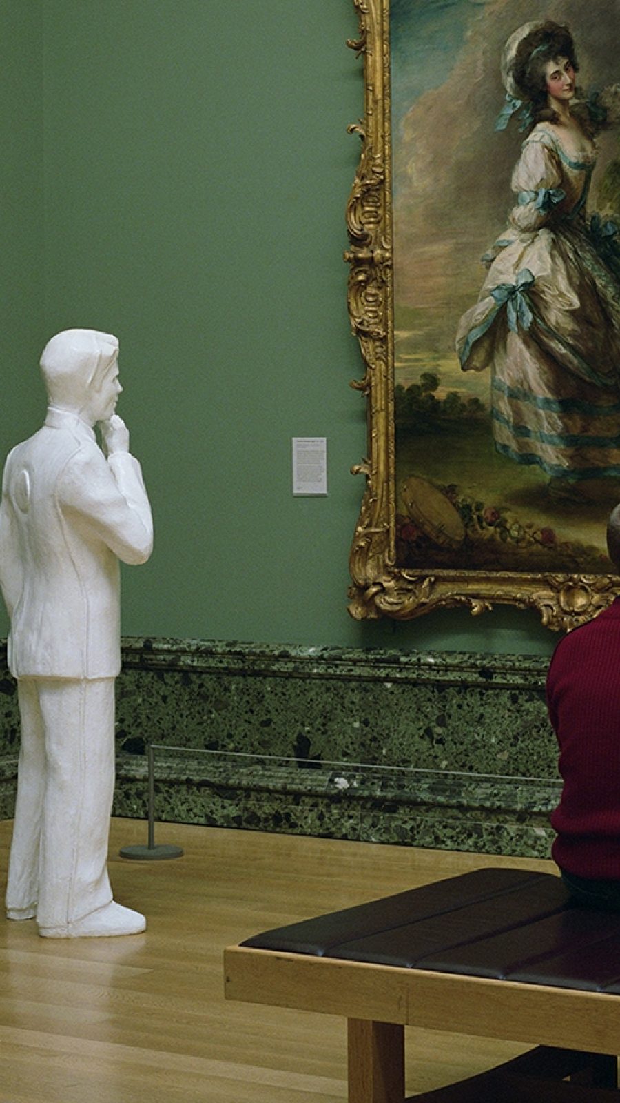
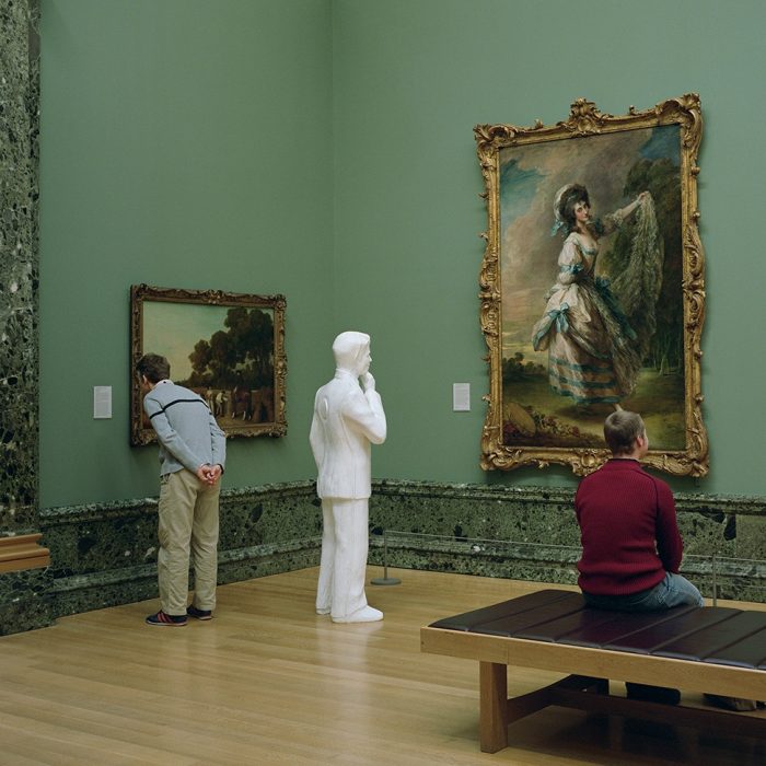
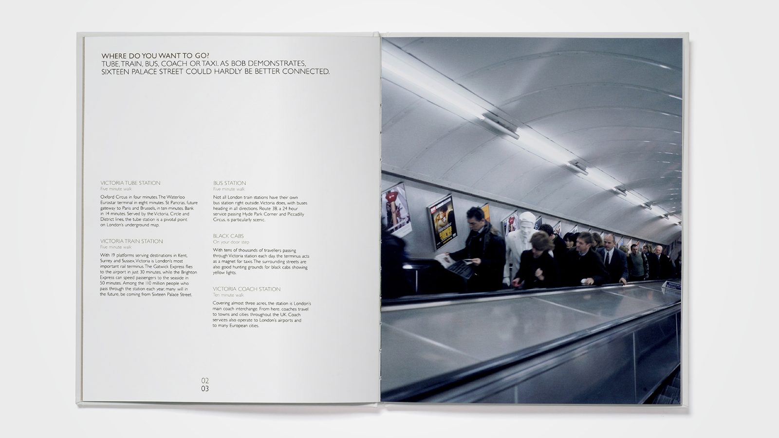
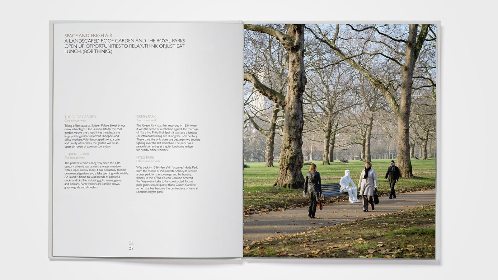
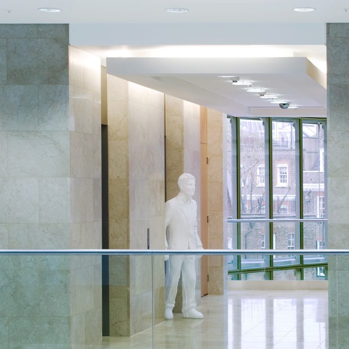
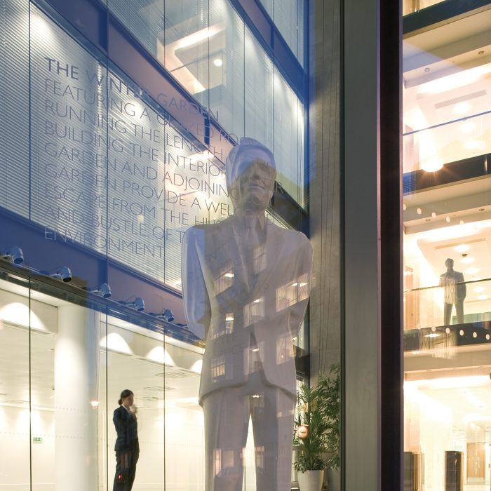
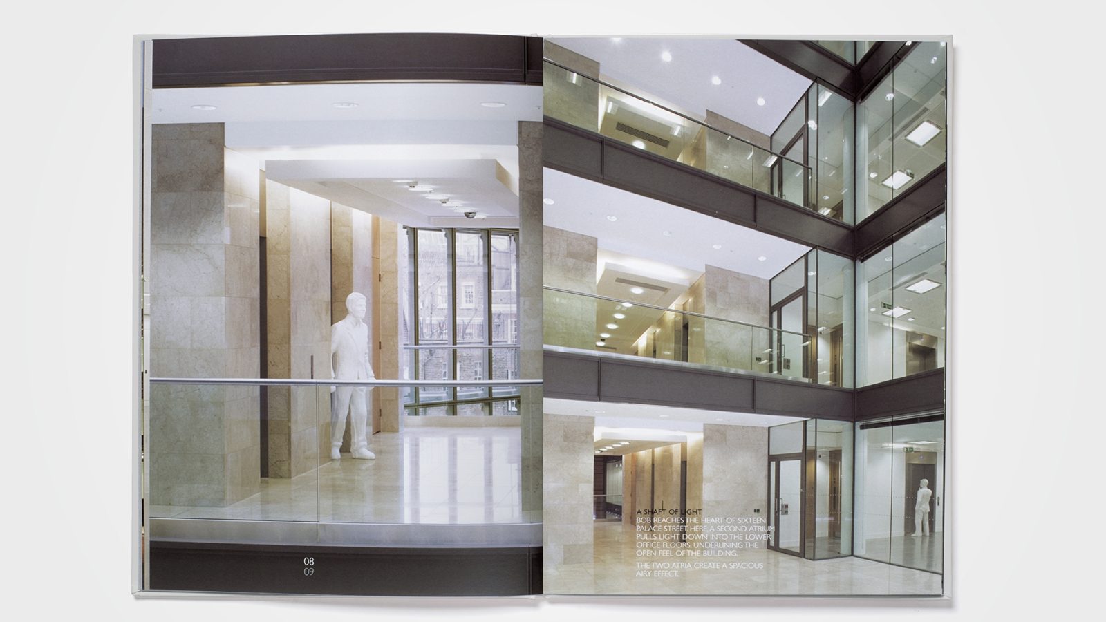
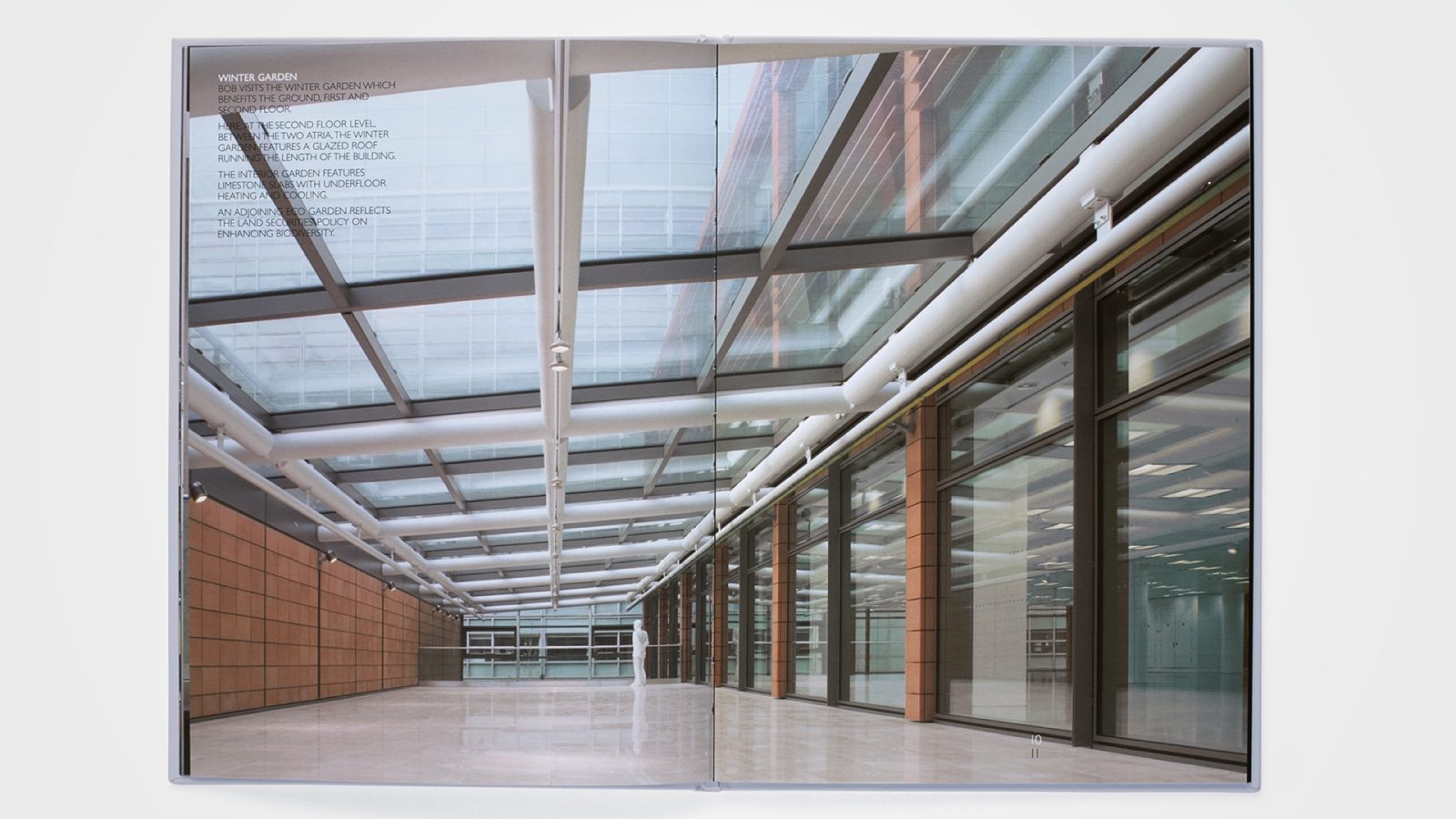
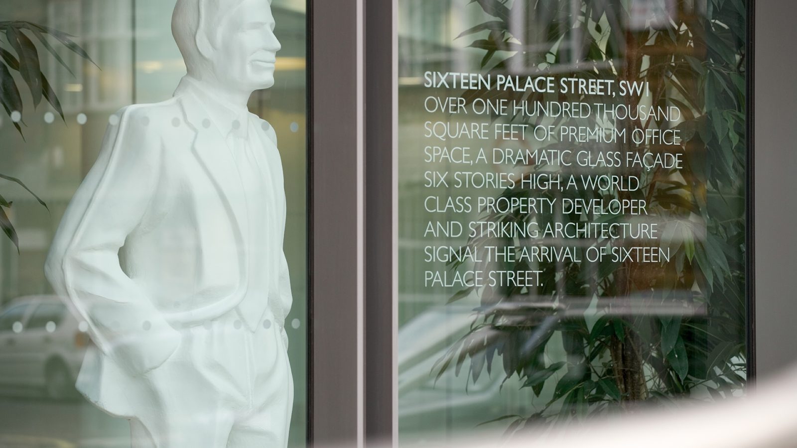
Located in the heart of Victoria, London SW1, 16 Palace Street is a Grade A office development. To create a distinctive visual branding theme, Radford Wallis drew inspiration from the archetypal white plastic figures used in architectural models. A character called ‘Bob’ was developed and he came in six life-sized (5ft 11 inches) poses. These figures were incorporated into building photography to provide a sense of scale, mirroring their role in architects’ models.
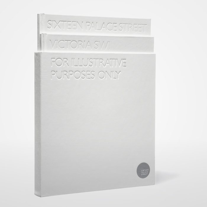
In the location brochure, Bob served as a guide, leading readers through Victoria’s amenities and attractions. For signage and window displays, life-sized Bob figures were strategically placed throughout the building to bring proportion to its expansive spaces. The launch party invitation further reinforced the concept with a miniature Bob, an actual architect’s model figure, providing a fitting introduction to the theme.


D&AD
D&AD is an organisation that champions excellence in design and advertising through its prestigious awards, educational programmes, and industry initiatives. Alongside recognising outstanding creative work, it plays a vital role in nurturing the next generation of talent.
Radford Wallis collaborated with D&AD from 2002 to 2008, creating various campaigns for the organisation’s initiatives, including D&AD President’s Lectures, Workout, D&AD Professional Development Programme, and D&AD’s Graduate Creative Programme.
D&AD Workout
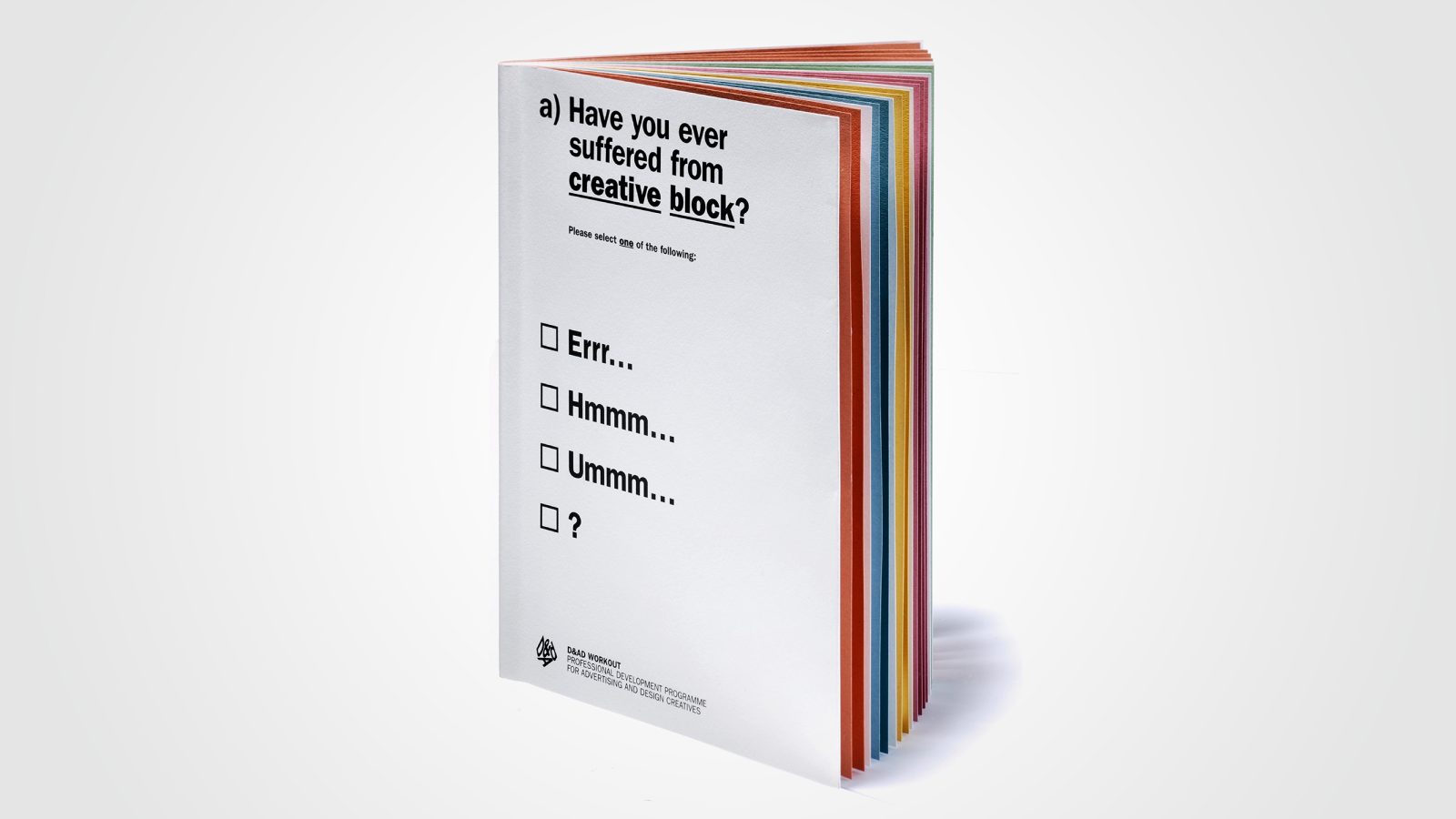
D&AD Workout is a professional development programme designed to help individuals in the creative industry sharpen their skills.
The demands of the creative industry often prevent professionals from pausing to reflect on how they can achieve their full potential. Courses on presentation, business, and creative development are frequently overlooked.
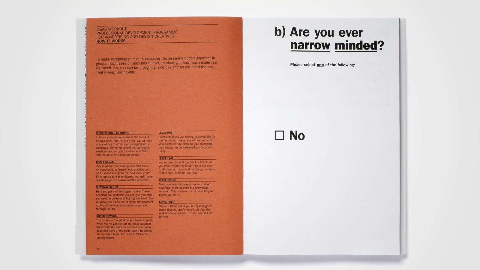
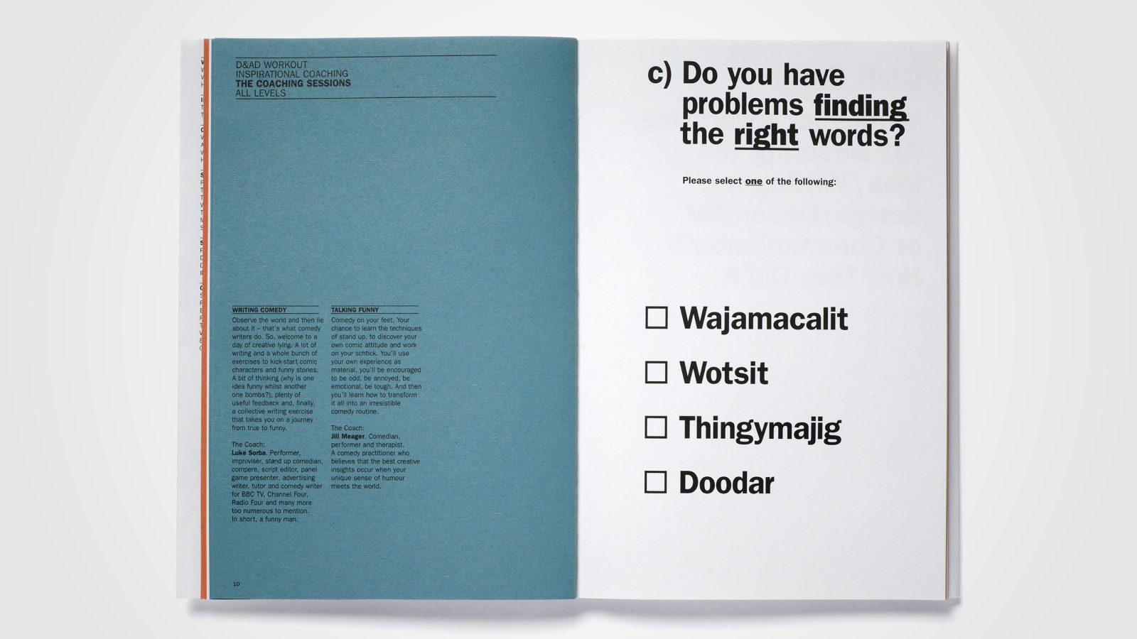
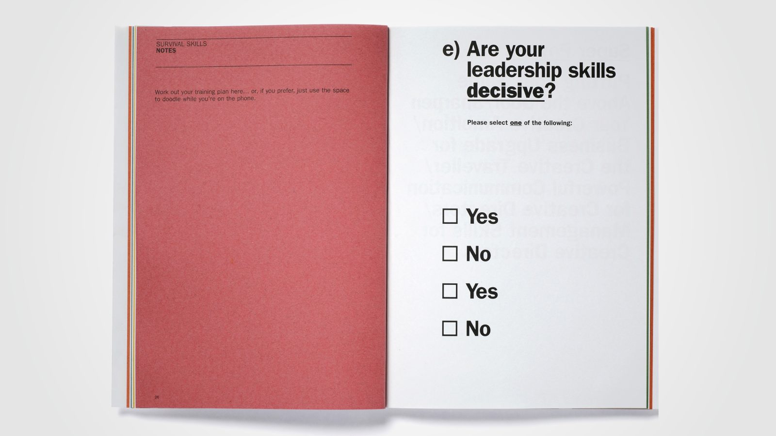
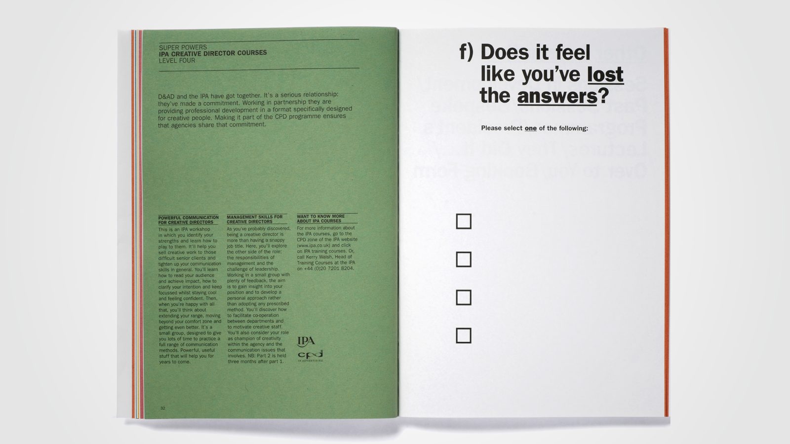
The Radford Wallis brochure for D&AD Workout challenges readers with a series of seemingly simple multiple-choice questions. The answers, however, reveal common issues faced by creative professionals.
Typographic Dandelion – 2007 Spring/Summer
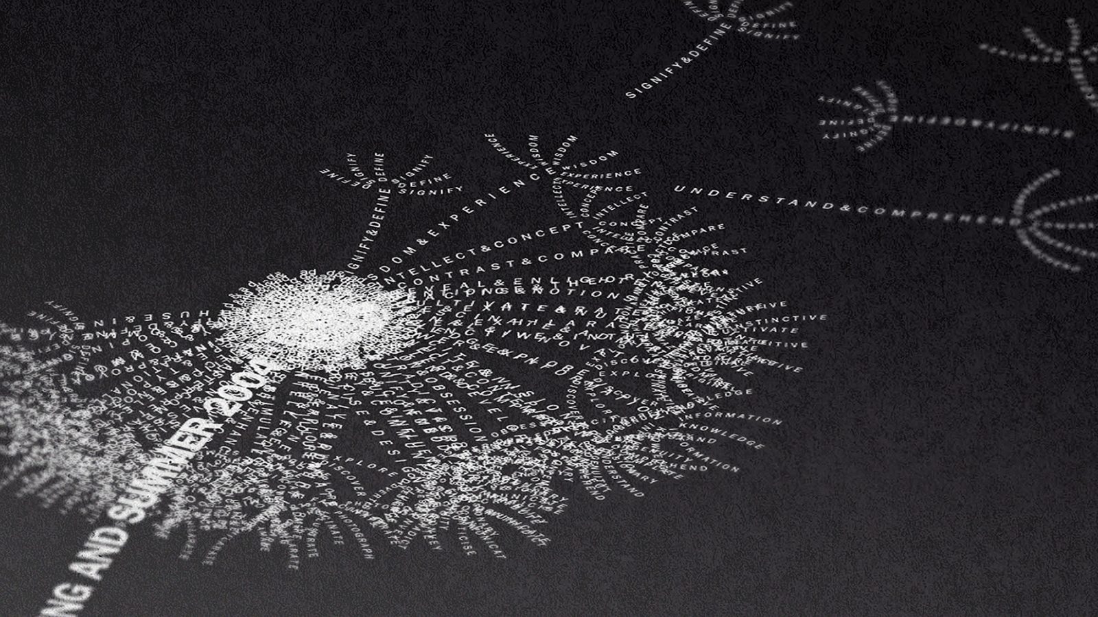
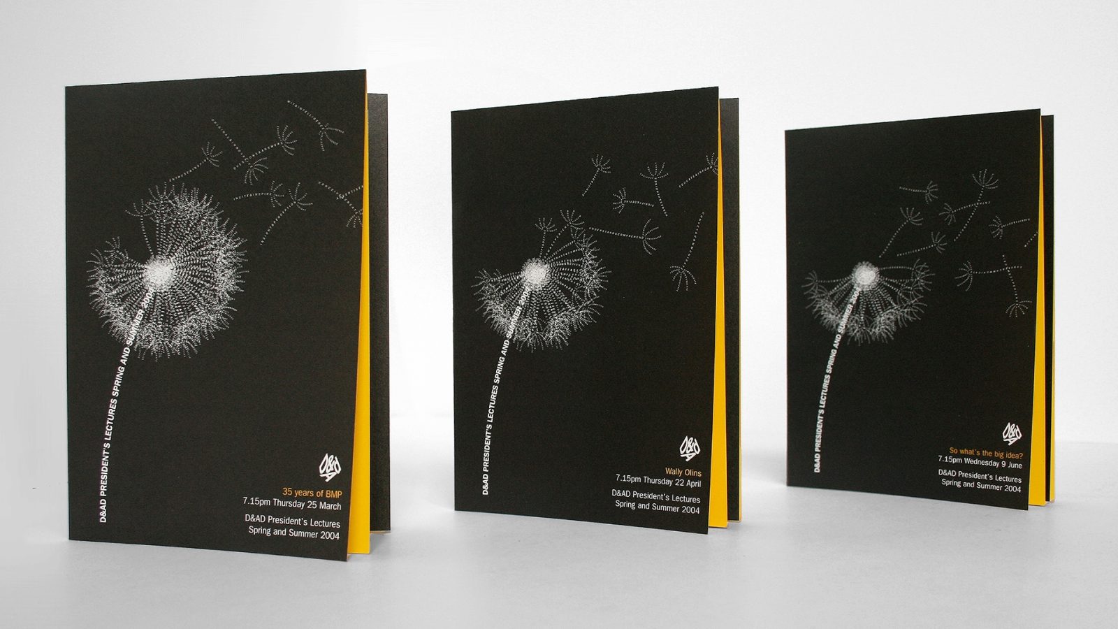
The D&AD President’s Lectures were esteemed events, valued for their inspiring and insightful content. To reflect this, the spring/summer campaign featured a typographic dandelion, where each seed represented a topic of knowledge. As the lecture series progressed, the dandelion dispersed its typographic seeds, with each ticket design showing fewer seeds than the previous one, symbolising the spread of knowledge.
Creative Heroes – 2004 Winter/Autumn
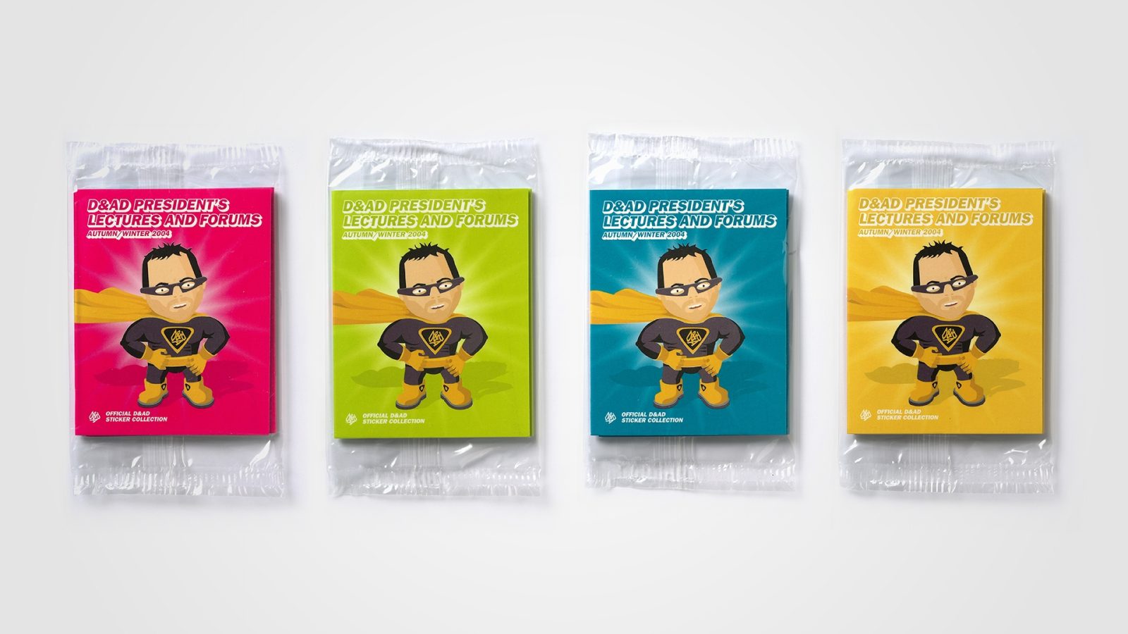
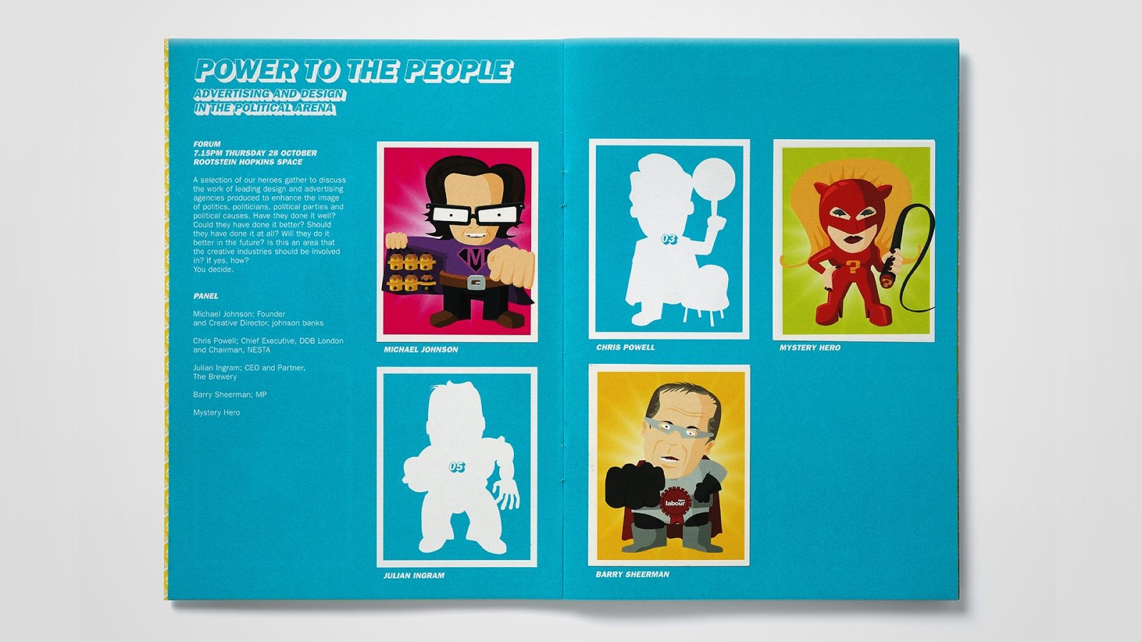
A playful and engaging approach was adopted, transforming each accomplished industry figure into a ‘Creative Hero.’ The direct mail brochure promoting the lectures took the form of an official sticker album, with each set of tickets accompanied by the corresponding Creative Hero stickers. Each Hero was playfully illustrated by MushyBees.


Opening Soon – 2003/2004
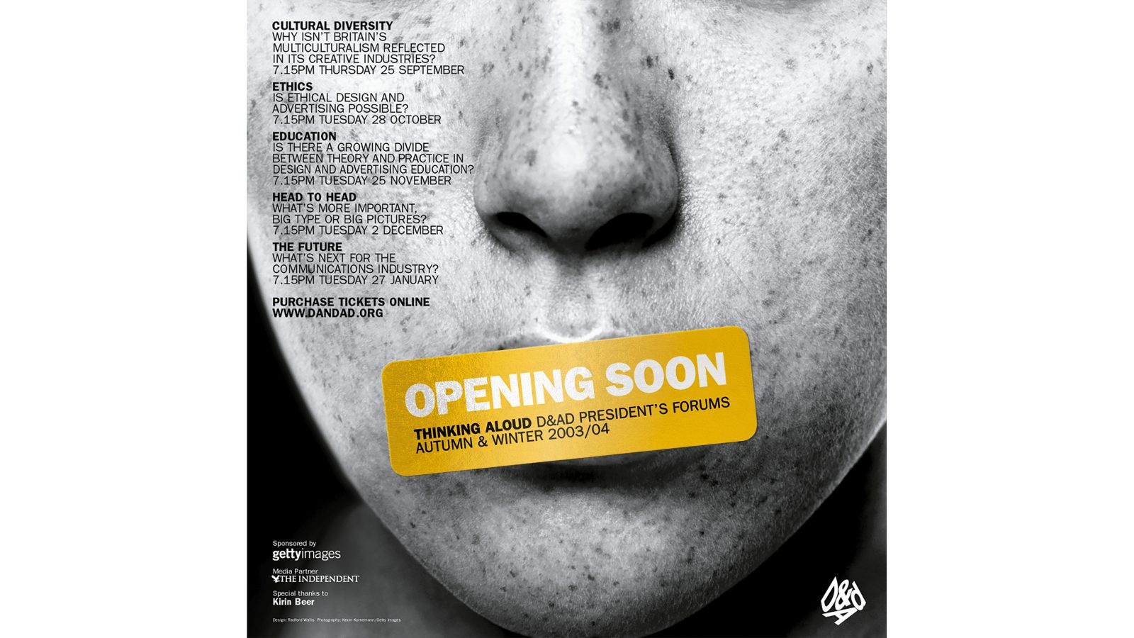
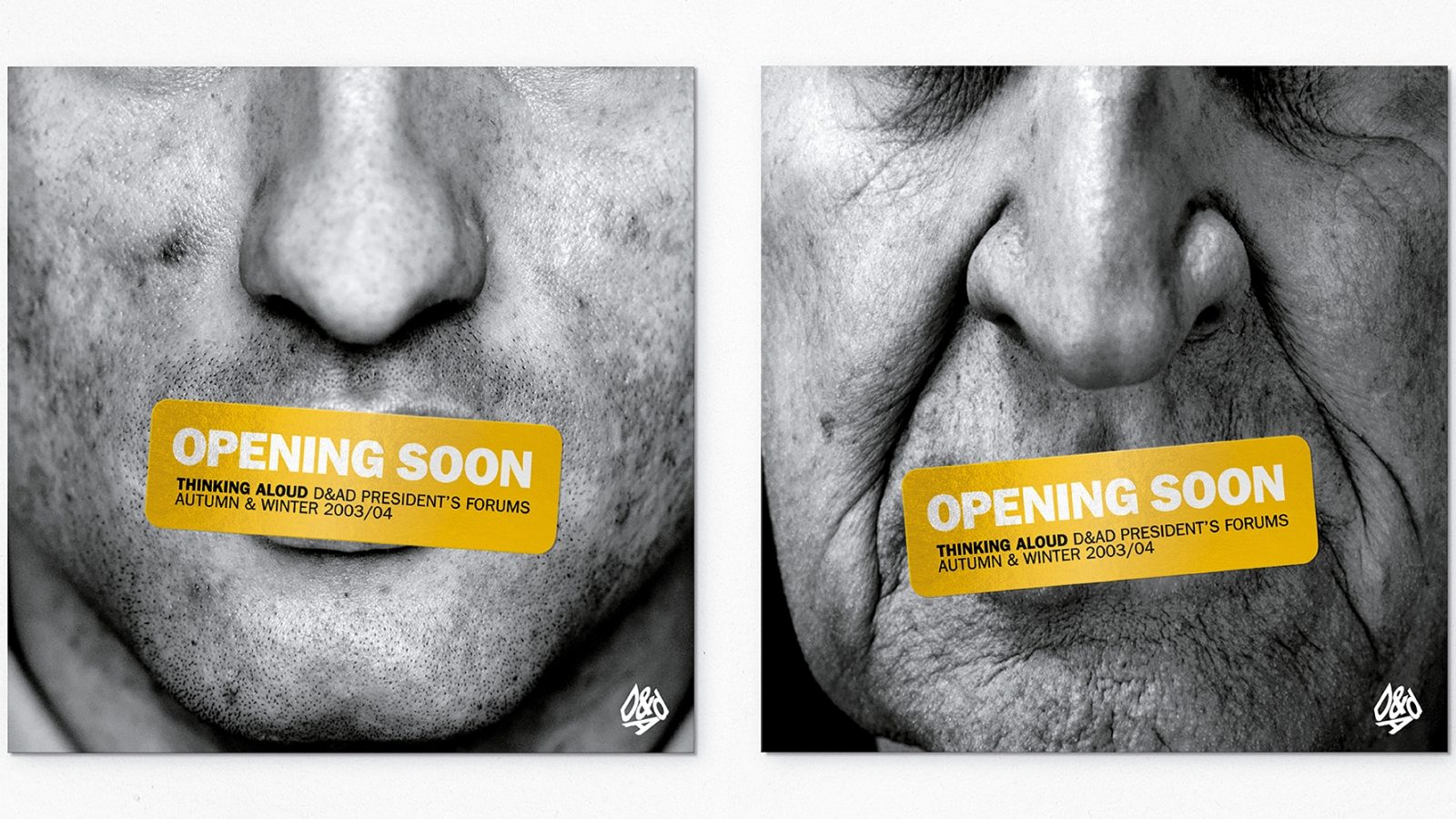
For this lecture series, then-President Nick Bell introduced a new format, shifting from individual lectures to interactive forums featuring panel discussions and greater audience participation. To reflect this shift playfully, ‘Opening Soon’ stickers were placed over the mouths of various individuals, symbolising the upcoming conversations.
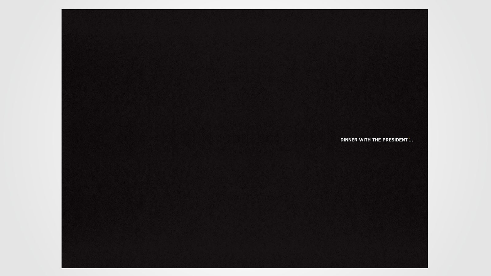
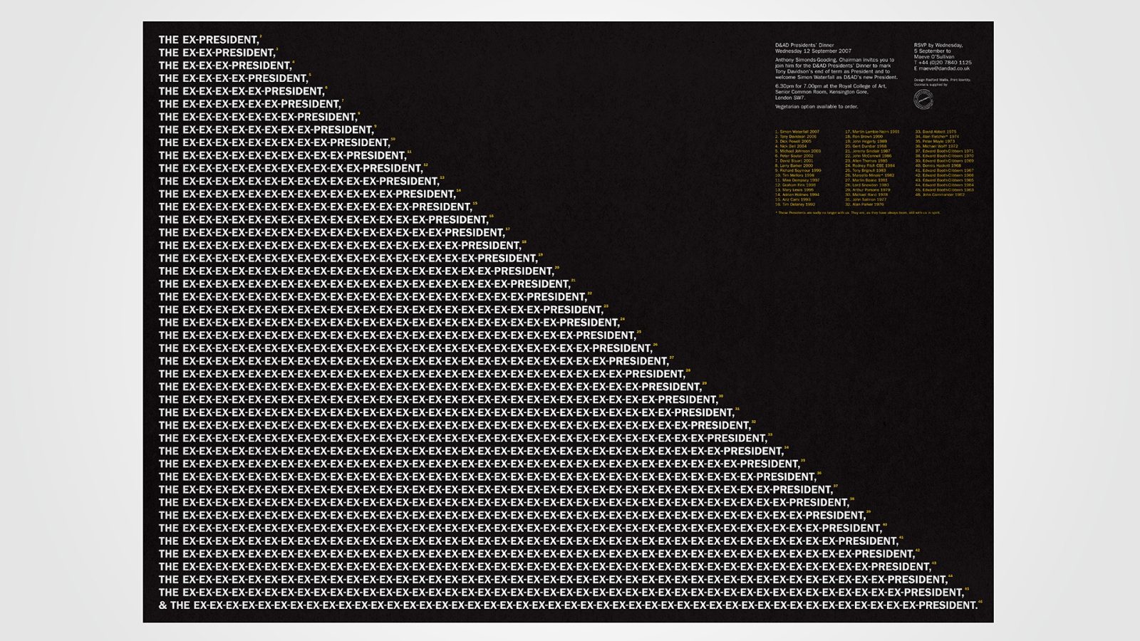
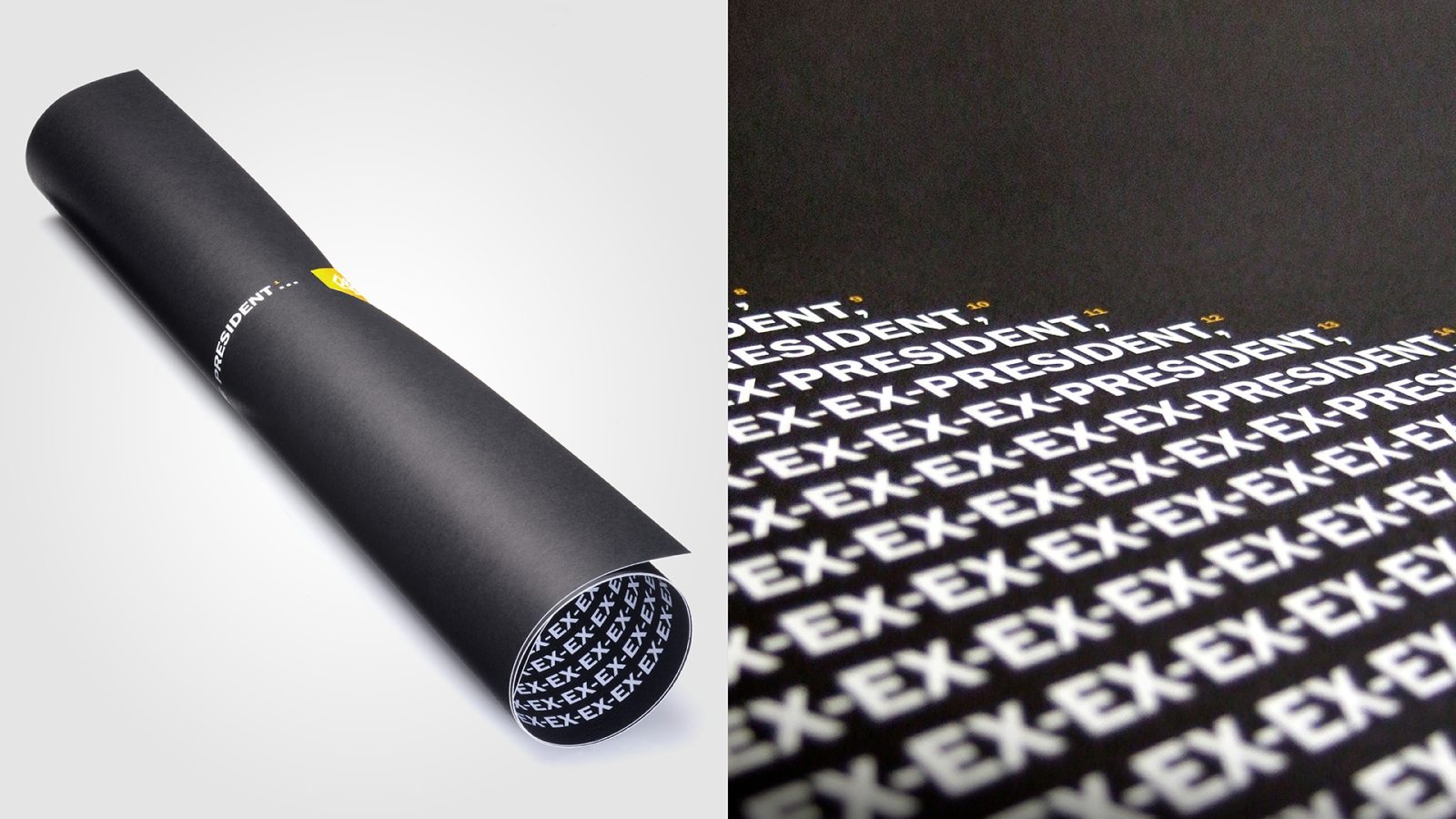
President’s Dinner Invitation
This prestigious annual event invited all former D&AD Presidents. A simple yet clever design using the phrase ‘Ex-President’ created a memorable invitation, highlighting the significance of the invitees.
My Cuisine
Long before the likes of Deliveroo and Just Eat, My Cuisine launched as an upmarket, freshly prepared food delivery service exclusively for businesses and organizations in Canary Wharf.
Radford Wallis shaped the brand’s identity, centring it around a simple yet distinctive marque that combined a knife and fork to form the silhouette of Canary Wharf’s iconic tower, One Canada Square. This identity was applied across stationery, menus, and the website, while a bespoke wooden knife and fork set reinforced the brand’s presence in a tangible, memorable way.


Fayre on the Square
The National Hospital Development Foundation (NHDF) is dedicated to supporting and improving hospital infrastructure across the country by raising funds and providing resources to enhance healthcare services, facilities, and equipment for better patient care and access.
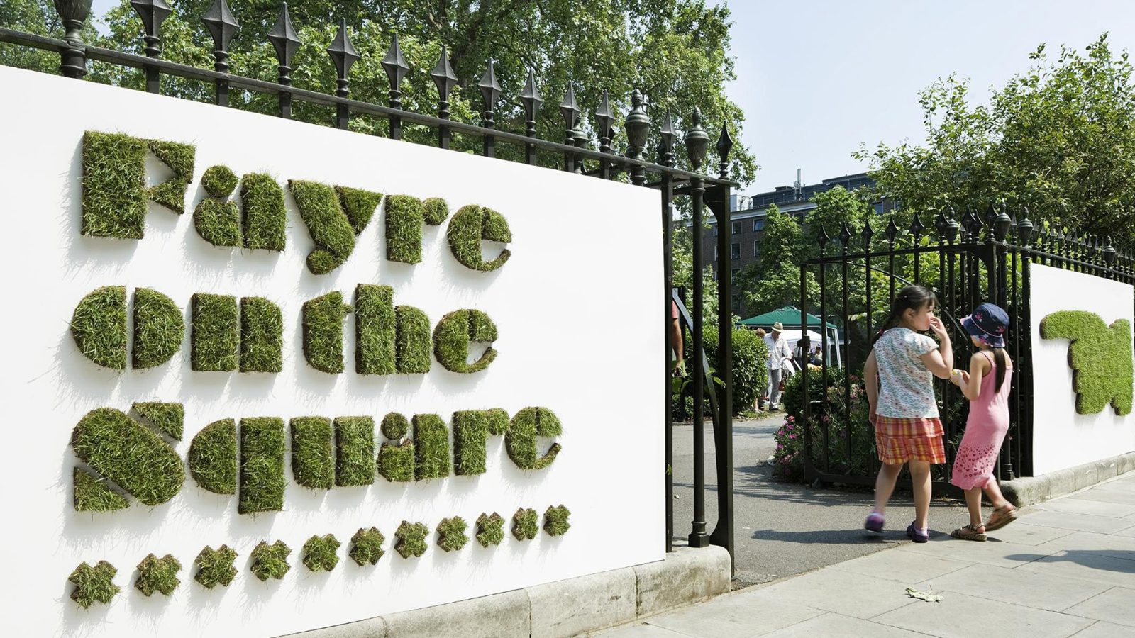
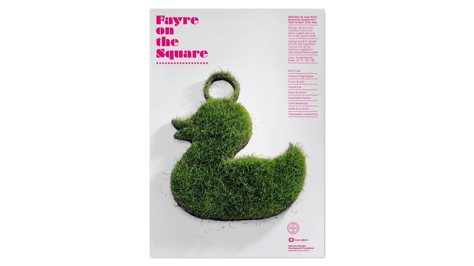
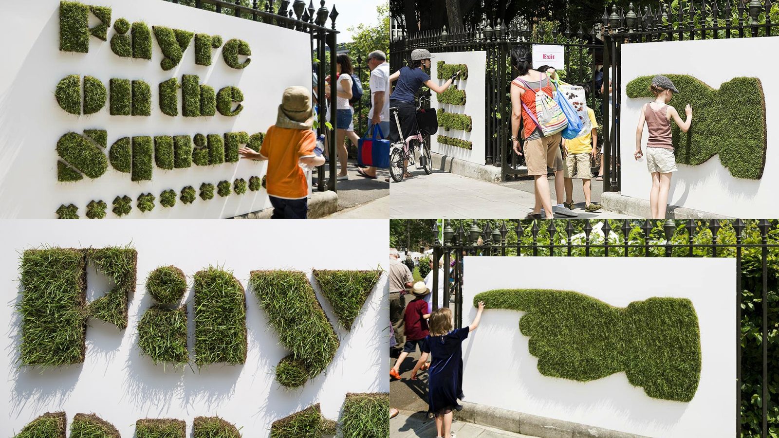
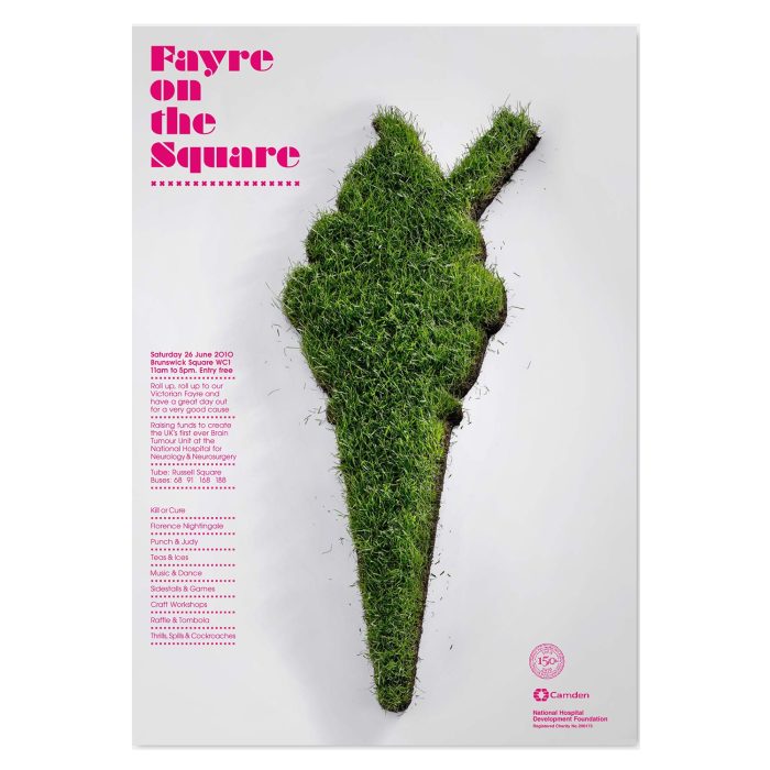
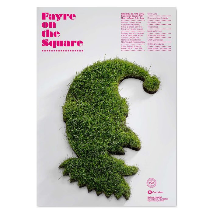
NHDF commissioned Radford Wallis to design a promotional campaign for a summer fayre fundraiser supporting the National Hospital for Neurology & Neurosurgery. With a limited budget and competing events, the challenge was to create maximum impact with minimal resources.
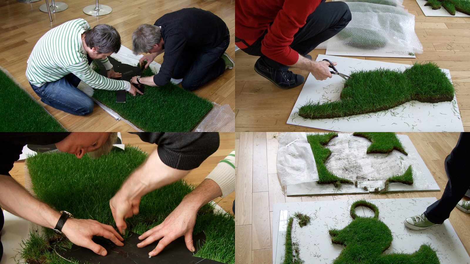
Radford Wallis developed a concept inspired by Brunswick Square’s urban green space. The campaign featured turf silhouettes of various fayre icons, which were photographed and used in posters and leaflets, with real grass cutouts serving as signage at the event entrances. This playful and engaging campaign successfully drove attendance and raised vital funds for NHDF’s work.

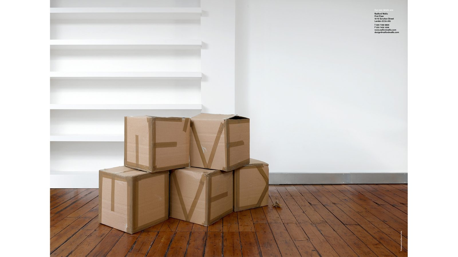
Radford Wallis Moving Card
Radford Wallis consistently demonstrated the ability to inject big ideas into the smallest of opportunities. One of the best examples was its moving announcement, designed as an A2 poster featuring a photograph of stacked cardboard removal boxes in an empty studio. A closer inspection of the boxes revealed the words ‘We’ve moved,’ subtly crafted from brown parcel tape sealing them.
