HGV
When HGV Design Consultants was founded in London in 1988, its aim was to bring intelligence, wit and freshness of ideas to the fields of identity and communication.
John Grey 1988 – 1998
Pierre Vermeir 1988 – 2009
The Almeida Theatre
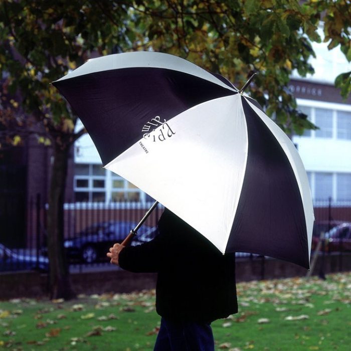
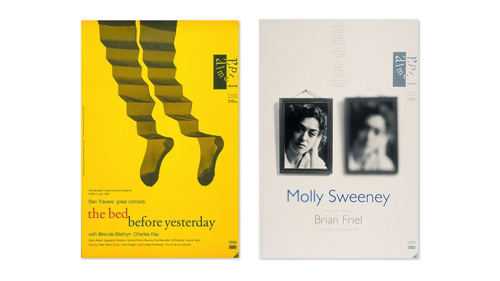
Over the past 40 years, the 325-seat Almeida Theatre in London’s Islington district has become one of the city’s most important centres for drama. Innumerable stars of film and stage have graced its stage, and its legacy includes the opening of many plays that have gone on to fame and acclaim on Broadway and in the West End. We were tremendously honoured when the theatre’s new artistic directors Jonathan Kent and Ian McDiarmid asked us to design a fresh logo for the prestigious venue.
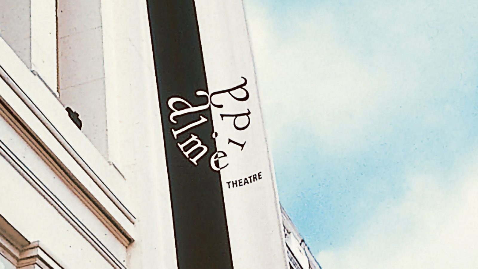
When Jonathan and Ian joined the Almeida, they decided to steer the theatre away from the eclectic and fringe programming it had staged in the previous decade, instead turning it into a hub for classical repertoire. The visual identity needed to reflect this shift in direction while appealing to both the cosmopolitan residents of Islington and the greater theatre-going audience of London. It had to work alongside graphics for a wide variety productions, plus be effective on signage, outdoor advertising and an array of promotional materials.
Striving to be both urbane and unpretentious, the hand-lettered logo drew upon the shape of the traditional theatre mask. The identity was designed to be easily reproduced and work comfortably alongside logos and graphics for any type of production the theatre might host. And black and white backgrounds helped to enhance the logo’s visibility and create a sense of drama.
The identity went on to win the agency's first Design Week Award.
Centenary of Nobel Prizes stamps – Royal Mail
“The Royal Mail’s new stamp collection for October pushes the boundaries of design and printing technology” – Headline, Financial Times, 25th September 2001
“It has got to be one of the world’s most technologically advanced stamp issues… It’s the first time in the world that a single set of stamps containing all these different printing technologies has been used.” – Mark Thomson, The Telegraph, 12th August 2001
“Children are going to love [the stamp], they will be sticking their mucky fingers all over it.” – Sir Harry Kroto, The Argus, 25th
September 2001
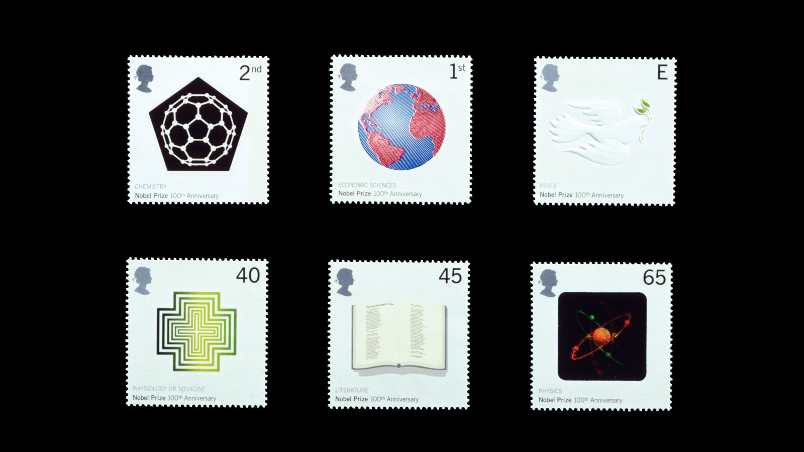
When the Nobel Prize turned 100 years old, the Royal Mail provided the agency with a really special opportunity – to prove that philately could be fun. To honour the anniversary, they designed a series of postage stamps paying homage to the curiosity and innovation that drives the prize’s laureates. Each of the six interactive stamps was dedicated to a Nobel category and printed with a special technique related to the topic.
The Economic Sciences stamp was created using intaglio printing, the same gravure technique used on bank notes. The Chemistry prize stamp featured interactive thermochromic ink; when warmed with the body heat from a finger, an illustration of a buckminsterfullerene C60 molecule changed into an image of an ion trapped within.
The Medicine stamp garnered the most press attention, with the BBC, Design Week and newspapers across the country noting that it was the UK’s first scratch-and-sniff stamp. (The scent was eucalyptus.) Likewise, the Physics stamp was the nation’s first stamp featuring a hologram – of a boron molecule.
Using microprinting, we were able to fit an entire TS Elliot poem onto the Literature stamp, which you would need a magnifying glass to read. Finally, emulating the category’s greatest prize winners, the stamp for Peace was made with nuanced care and a simple, hopeful message: a subtly embossed image of a dove.
Roast
Situated on the top floor of Floral Hall in London’s bustling Borough Market, Roast became an instant icon in London’s restaurant scene. Opened by Iqbal Wahhab – the owner of legendary Indian eatery The Cinnamon Club – the new restaurant promised the then-novel experience of British recipes cooked with market-fresh, seasonal produce procured from stalls below. A continuing success, boasting a cookbook and ever-packed dining room, Roast remains a leader within London’s gastronomy scene.
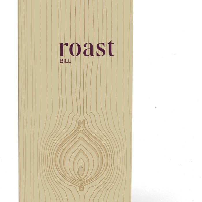
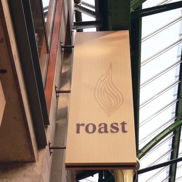
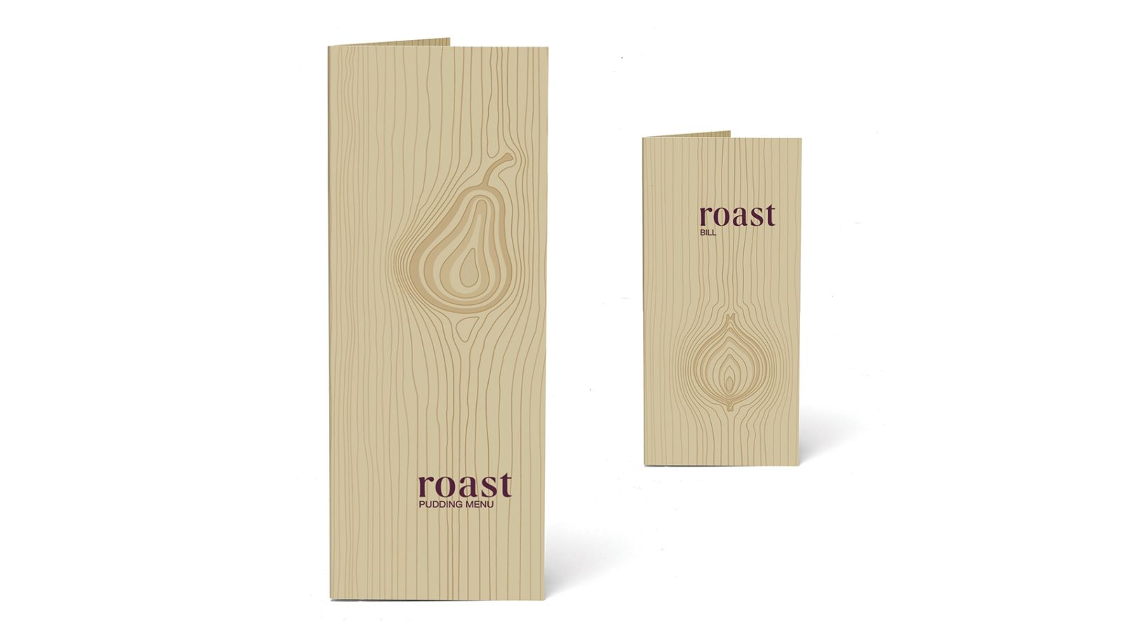
At the time of launch, the restaurant’s market-to-table concept was ground-breaking, so its branding had to help communicate the fresh take on fine dining. To honour the bounty of the British countryside, its farmers and the market’s sellers, the agency based the identity around a knot in wood, which was paired with an approachable yet decidedly elegant logotype.
The dynamic wood-knot mark could be morphed into different shapes: A pear on the pudding menu, a bottle on the wine list, stalks of celery on the bar menu. Finally, for the bill at the end of the meal, the mark was shaped as an onion, since both the vegetable and the meal’s cost would bring tears to diners’ eyes.

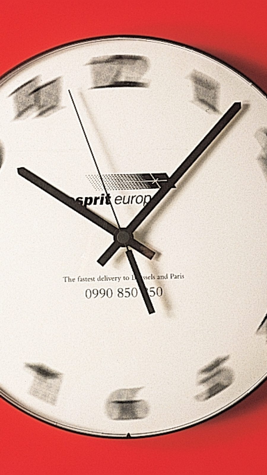
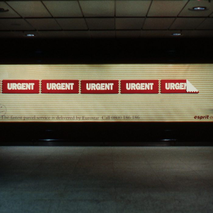
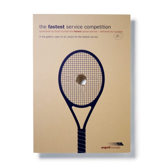
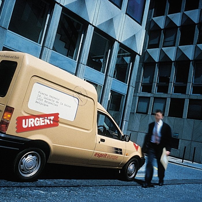
Esprit Europe
The brief was to generate a new name and create an identity for Eurostar’s express delivery service exploiting the fast connection between the UK and continental Europe.
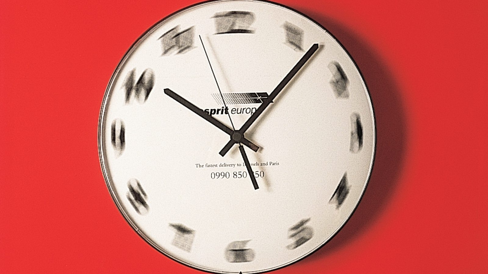
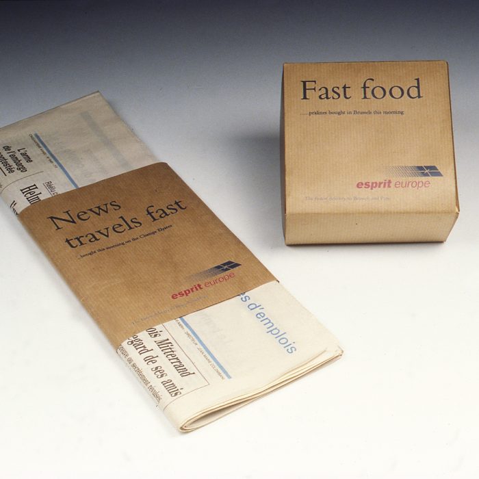
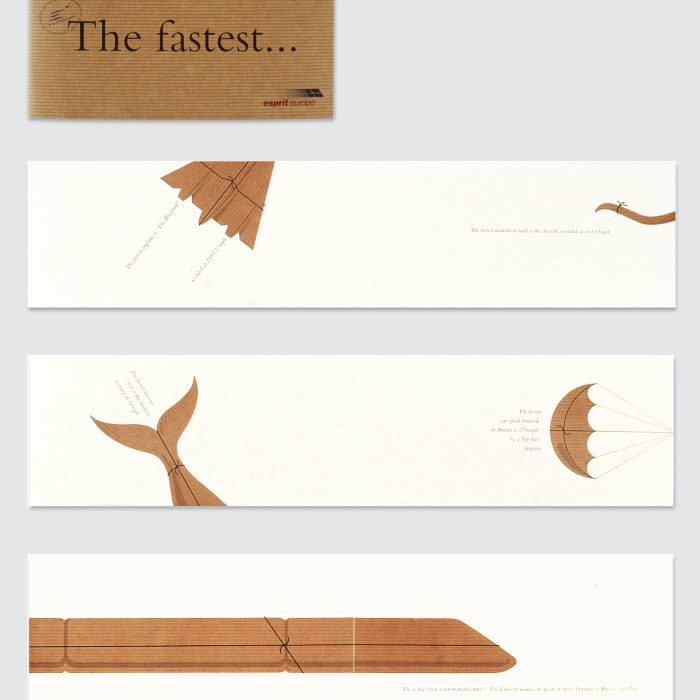
The logo echoes the shape and speed of the Eurostar trains and the promotional materials reinforce the idea of speed. The plain brown backgrounds refer to brown wrapping paper.
In its first year of business Esprit Europe won a Design Effectiveness Award for delivering outstanding results.

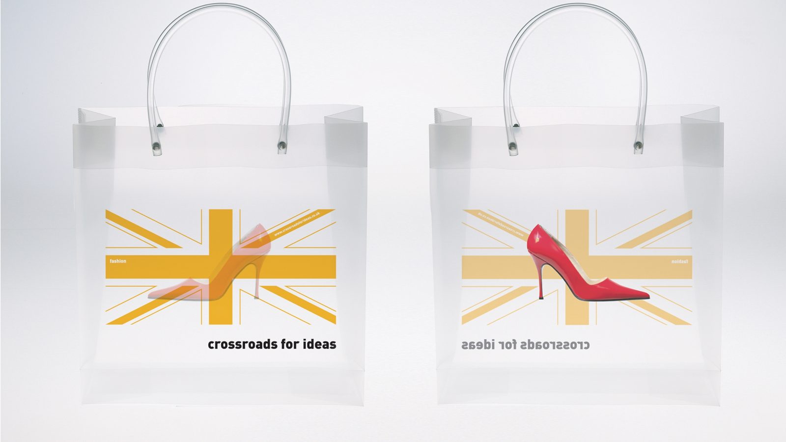
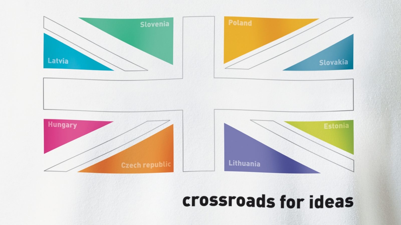
Crossroads for Ideas
In 2004, the UK’s Foreign & Commonwealth Office and British Council created a campaign to welcome eight Central Europe nations into the EU. The goal of this Crossroads for Ideas initiative was to demonstrate that Britain was a vibrant hub of creativity, eager to attract investment and talent from citizens in new member states. But since the research showed that the target audiences were often confused about the different meanings of ‘Great Britain’ and ‘UK’, the campaign had to avoid using these terms. A visual solution would have to carry the central message of the campaign.
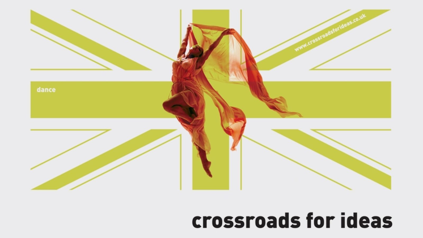
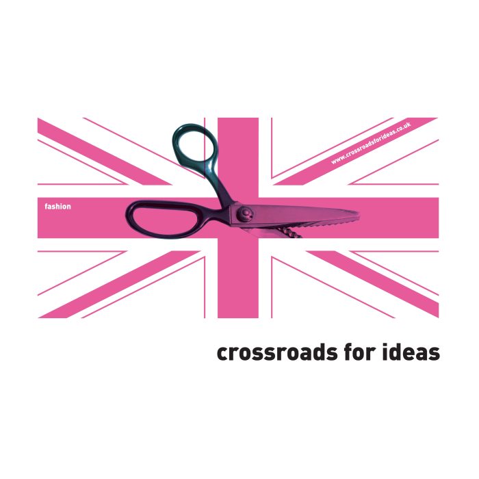
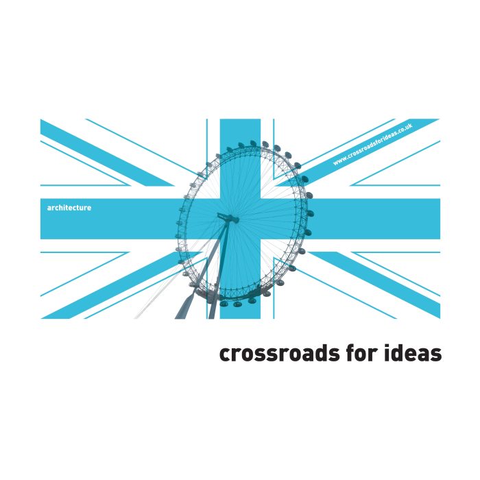
The Union Jack might seem like it was an obvious answer, but the choice of this device and its subsequent treatment were not straightforward. Working in tandem with Tony Muranka, the agency was originally attracted to the symbol because everybody understands that the flag represents the UK, plus its lines meet at a ‘crossroads’ in the centre of the design, reinforcing the campaign’s copy. But the flag’s traditional colours couldn’t work, as the campaign was about innovation and modernity, and it needed to avoid appearing overly nationalistic. They would have to reinterpret the emblem and create a framework for pairing it with a range of messages.
In April 2004, Tony Blair launched the Crossroads for Ideas initiative to great acclaim. In the following years, the brightly coloured design went on to become a central communication device at numerous cultural events, cementing the UK’s reputation as ‘Cool Britannia’.