Fivefootsix
Founded by two friends Mark McConnachie and Algy Batten in 2005, Fivefootsix believed in thinking bigger to communicate better.
In their 11 years, they grew to a team of 16 people with an open and friendly studio ethos.
They worked as creative partners to clients such as Ben & Jerry’s, Unicef, Vita Coco, UEFA, Nokia and BBC Children in Need.
They dared their clients to think bigger and dig deeper to find their story, then articulated it through relevant, effective and carefully crafted design.
They prided themselves on being relentlessly inquisitive and connected, always striving to listen harder and look afresh.
Clients
Ben & Jerry’s – Ice cream makers, Global
BBC Children in Need – Charity, UK
Candlestar – Art and education, Global
Coco Cafe – Soft drink, Global
Cyclebeat – Indoor cycling studio, London
EBRD – Project financing, Eastern Europe/SEMED
Long Harbour, Property development, UK
Gymbox – Gym chain, London
Hot Bikram Yoga – Yoga studios, London
Syngenta – Agricultural, Global
UEFA – Football’s european governing body, Europe
UNICEF – Charity, Global
Vita Coco – Soft drink, Global
Wheyhey – Protein ice cream, UK
XYZ – Indoor cycling studio, Hong Kong
Algy Batten
BBC CiN Designer Pudsey
How does a teddy bear become a fashion icon?
We worked with BBC Children in Need for 5 years, looking at their core brand as well as bespoke fundraising initiatives. The vision of the BBC’s UK corporate charity is simple and inspiring – that every child in the UK has a childhood which is safe, happy, secure and allows them the chance to reach their potential.
So over the years, we got to know the Children in Need mascot, Pudsey Bear, pretty well. You could say we’re his brand guardians. But at first, even we found it hard to imagine Pudsey as a fashion icon.
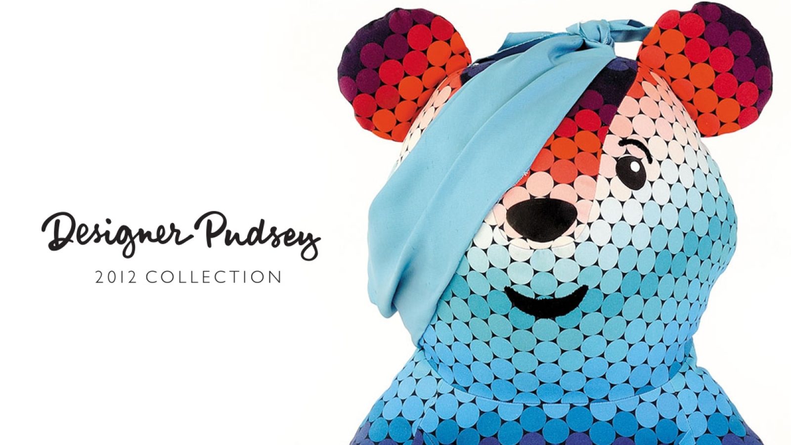
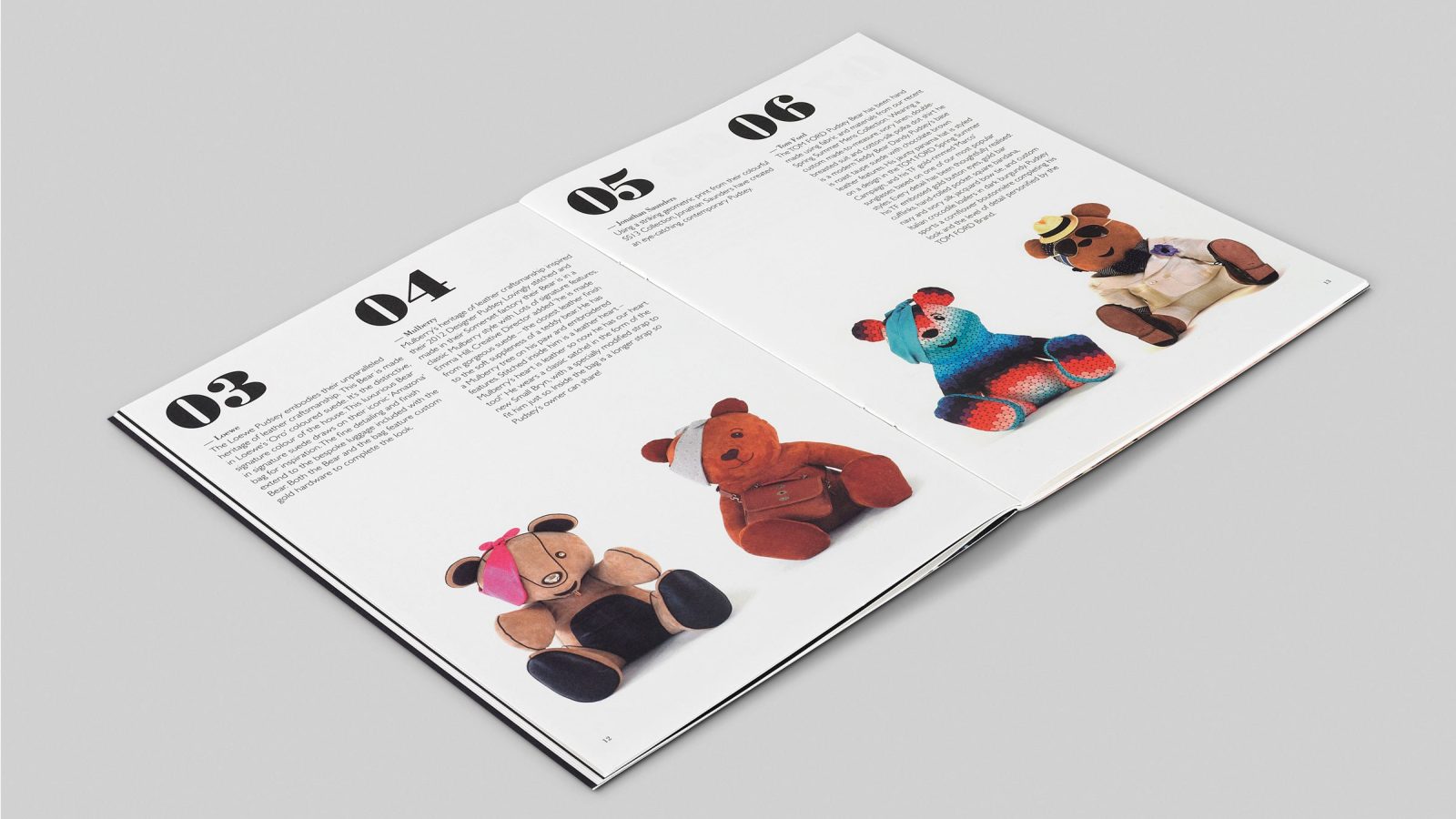
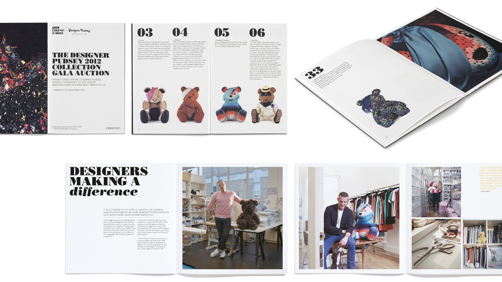
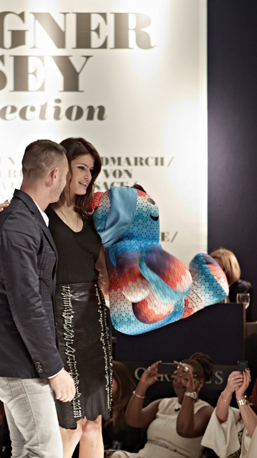
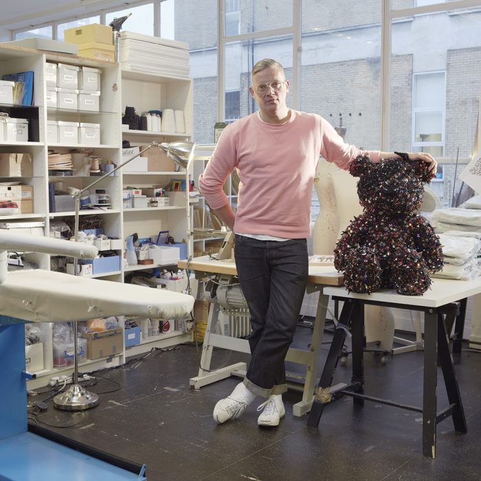
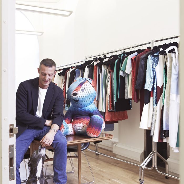
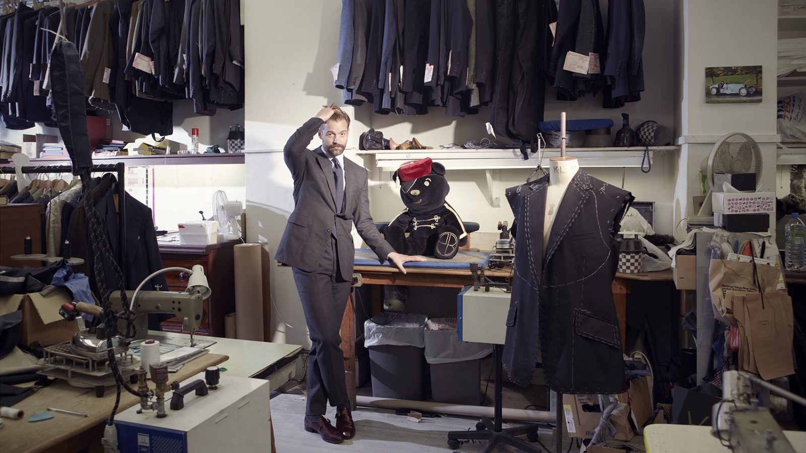
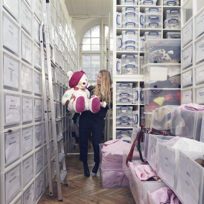
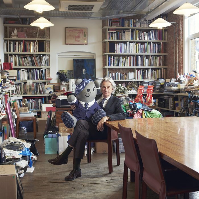
For the Designer Pudsey project, we asked 35 leading fashion designers – from Vivienne Westwood to Victoria Beckham, from Prada to Gucci – to reimagine Pudsey, giving him a makeover so he was the most stylish bear in town. The designer bears were to be displayed in the windows of Selfridges, then auctioned at Christie’s and online. The idea was inspired by the charity’s strategy of targeting specific audiences. In this case, the project, curated by Katie Grand, set out to involve those who work in – or simply love – fashion and style. It was also a good example of designers working to make a difference in the wider world.
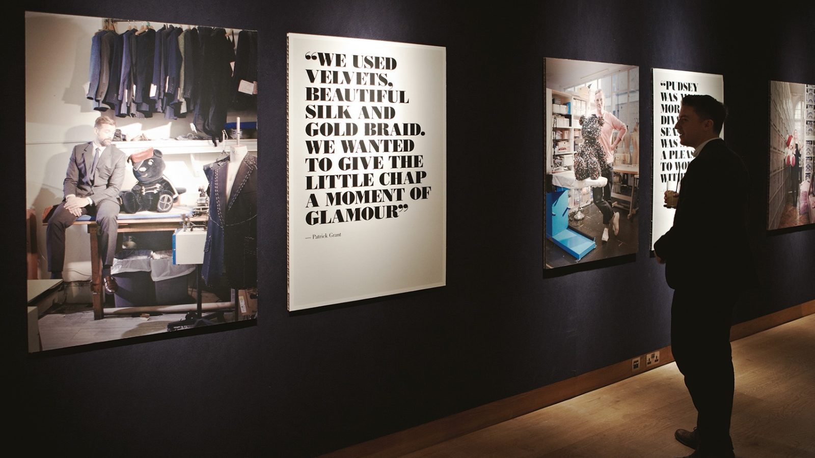
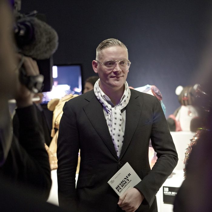
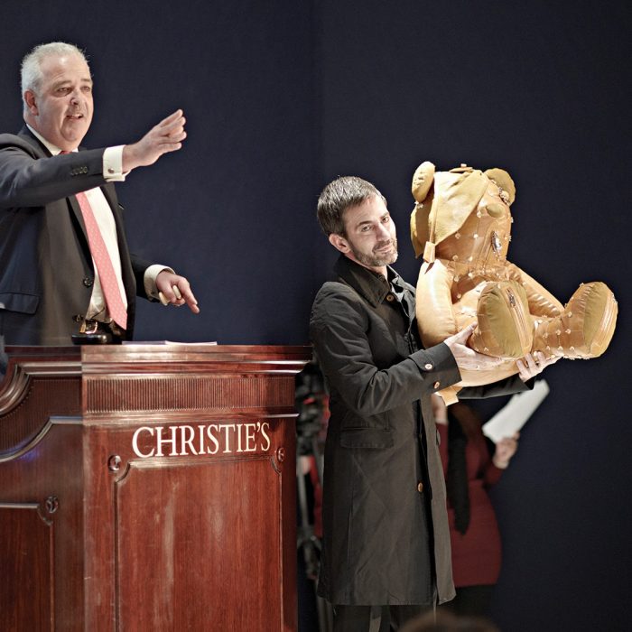
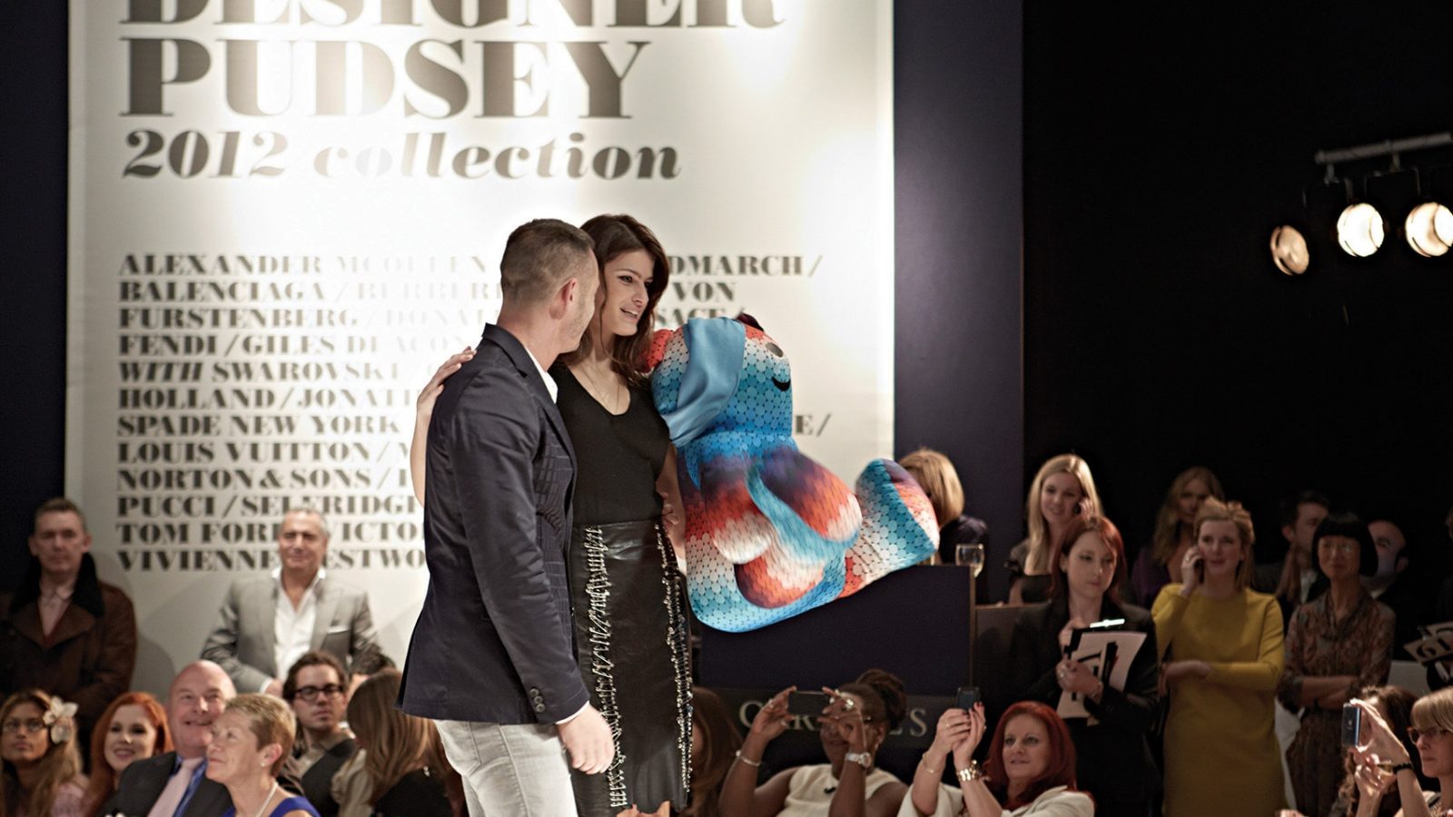
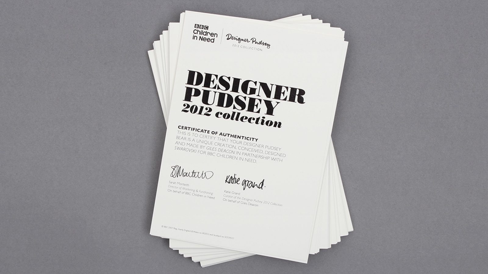
With responsibility for all branding across the project, we were there every step of the way to ensure Pudsey didn’t put a paw wrong. From designer logo to auction catalogue, a luxury invitation to venue design – we took Pudsey to the catwalk, to the Christmas windows at Selfridges, we splashed him across the style magazines and shared him with the world in a whole new light. Pudsey never looked so good. And we’re delighted to say the project raised £195,000 for Children in Need.
XYX
A life-changing moment
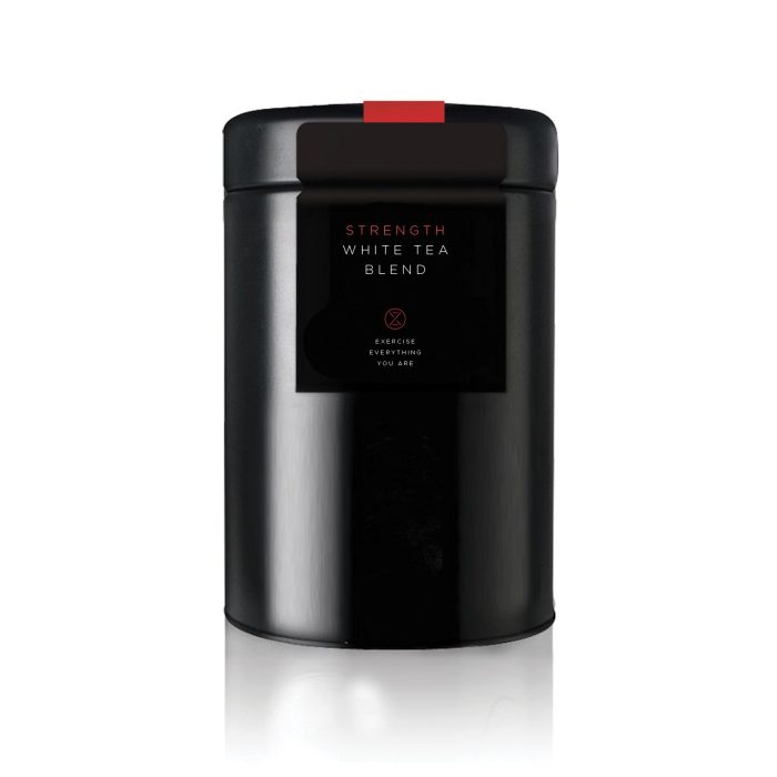
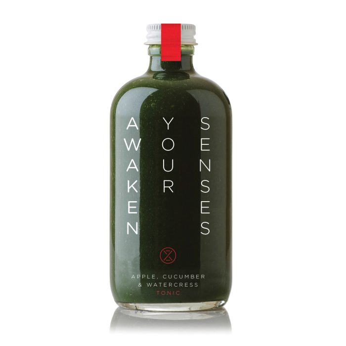
"A desire to make cardio exercise more fun for the people of Hong Kong, to encourage everyone to move their bodies to relieve stress in this fast-paced city and to create a place that is a mixture of fitness, entertainment, performance and a safe sanctuary for people to release, regroup and recharge their body and mind”
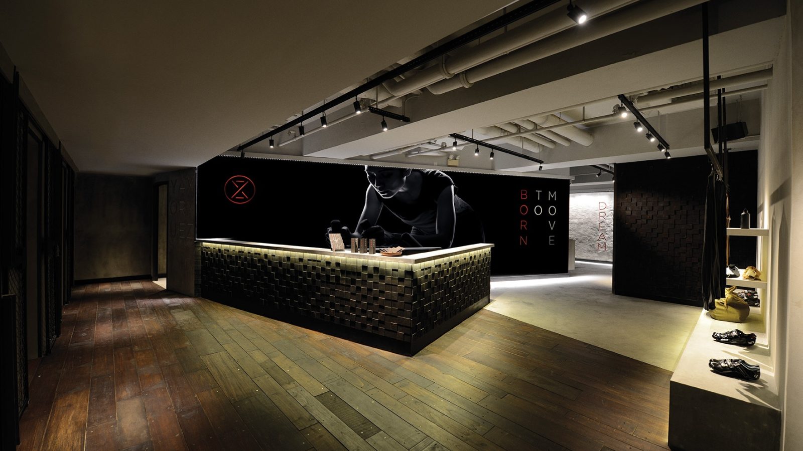
That’s Belinda Koo describing the starting point for the extraordinary XYZ indoor cycling studio she has established in Hong Kong. In her words, XYZ is ‘a hidden cave designed to escape the intensity of day-to-day life.’
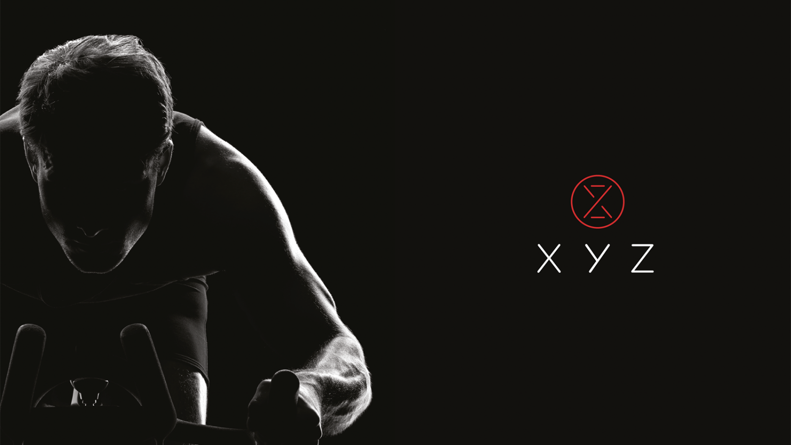
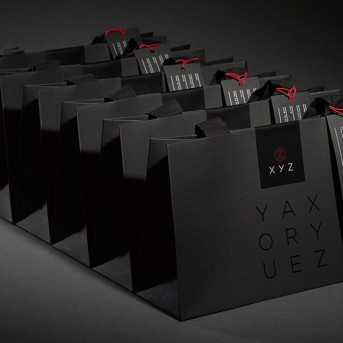
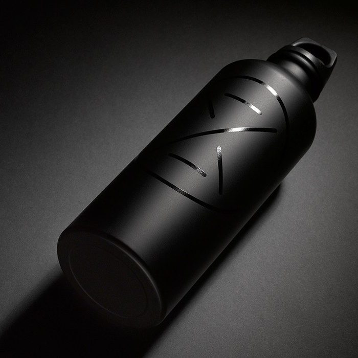
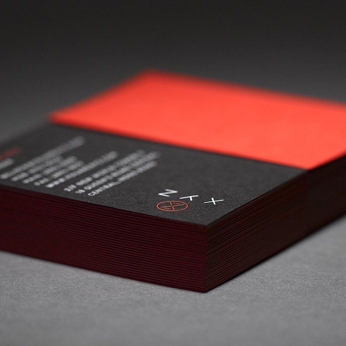
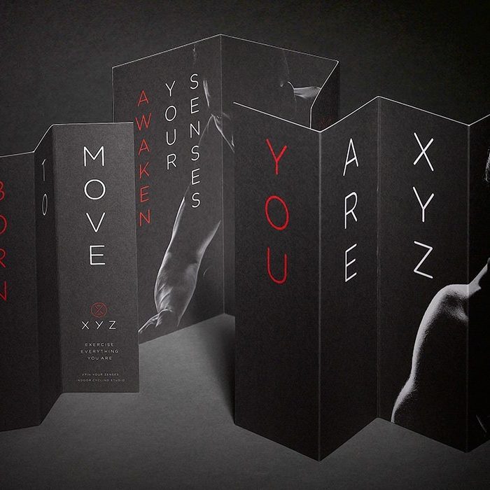
Searching for an agency able to capture and express the spirit of XYZ, Belinda heard about our work for London indoor cycle studio Cyclebeat. Through long-range conversations between Hong Kong and London, we started to understand her vision, then help her to develop the club and the brand.
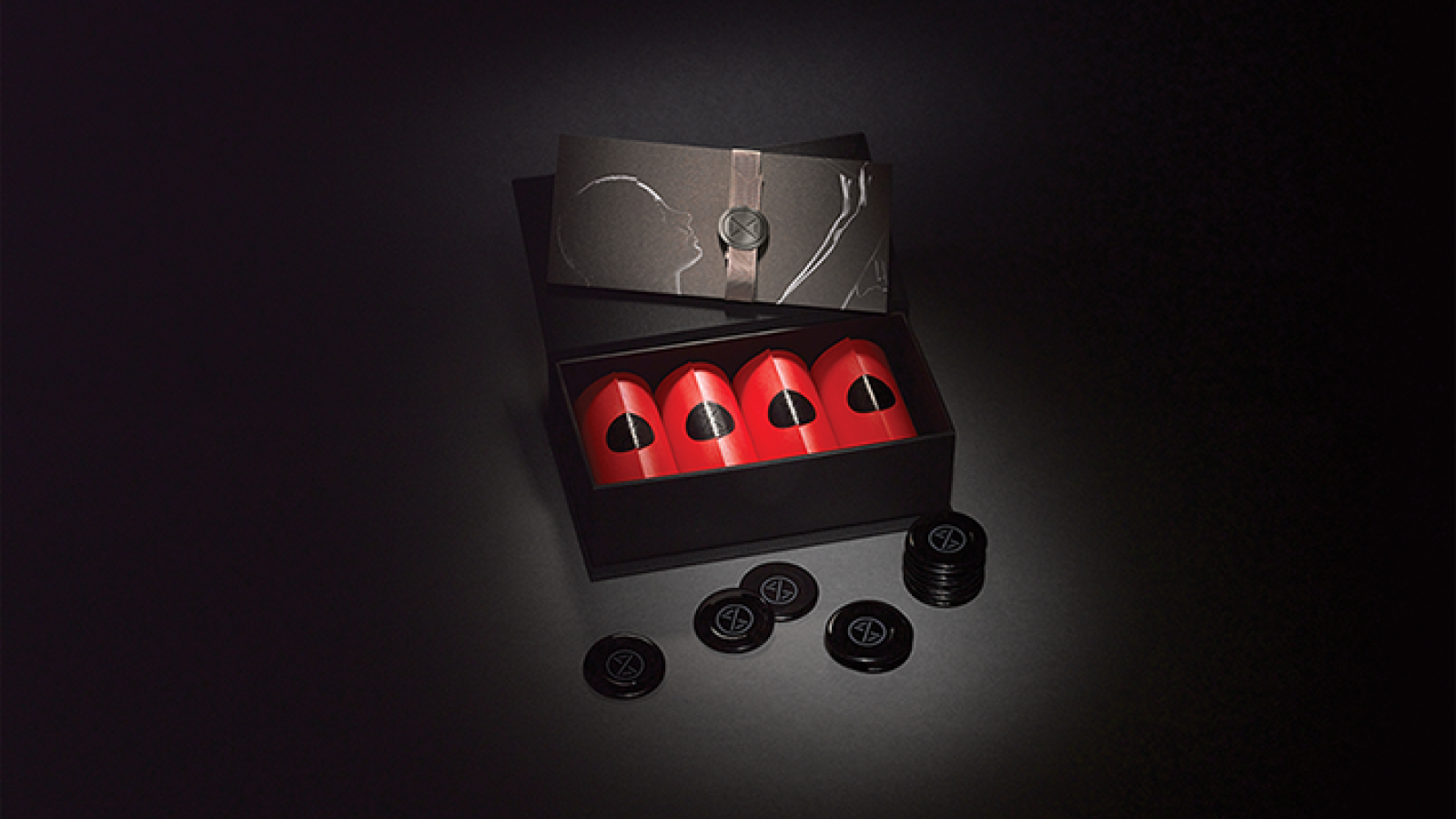
XYZ offers both the yin of calmness and contemplation and the yang of demanding physical exercise. Aiming to create an aspirational, encouraging and spiritual atmosphere, it provides a stylish space where people can take time to care for their body and their mind. This has inspired a growing community of members who feel XYZ is a second home.
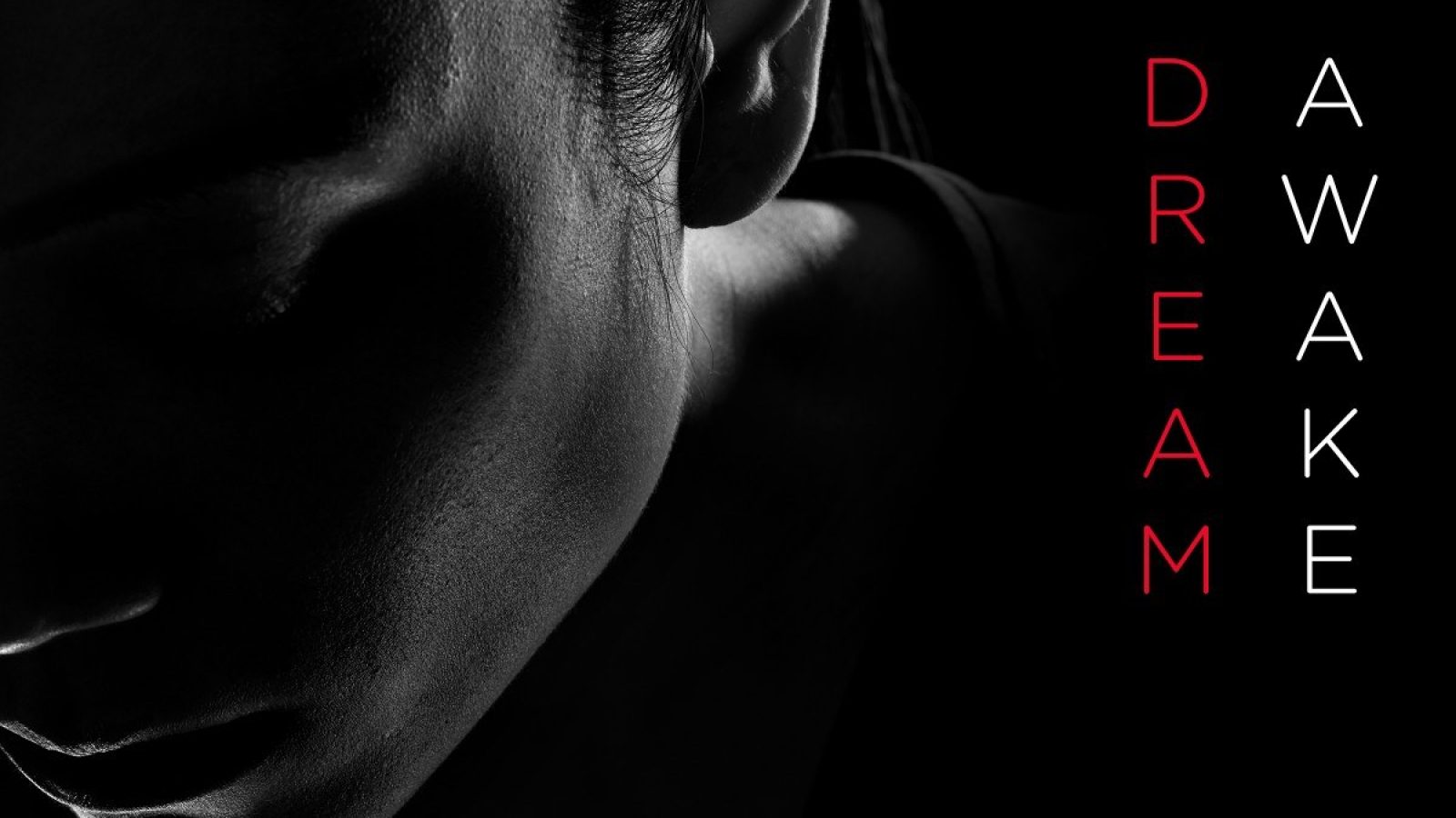
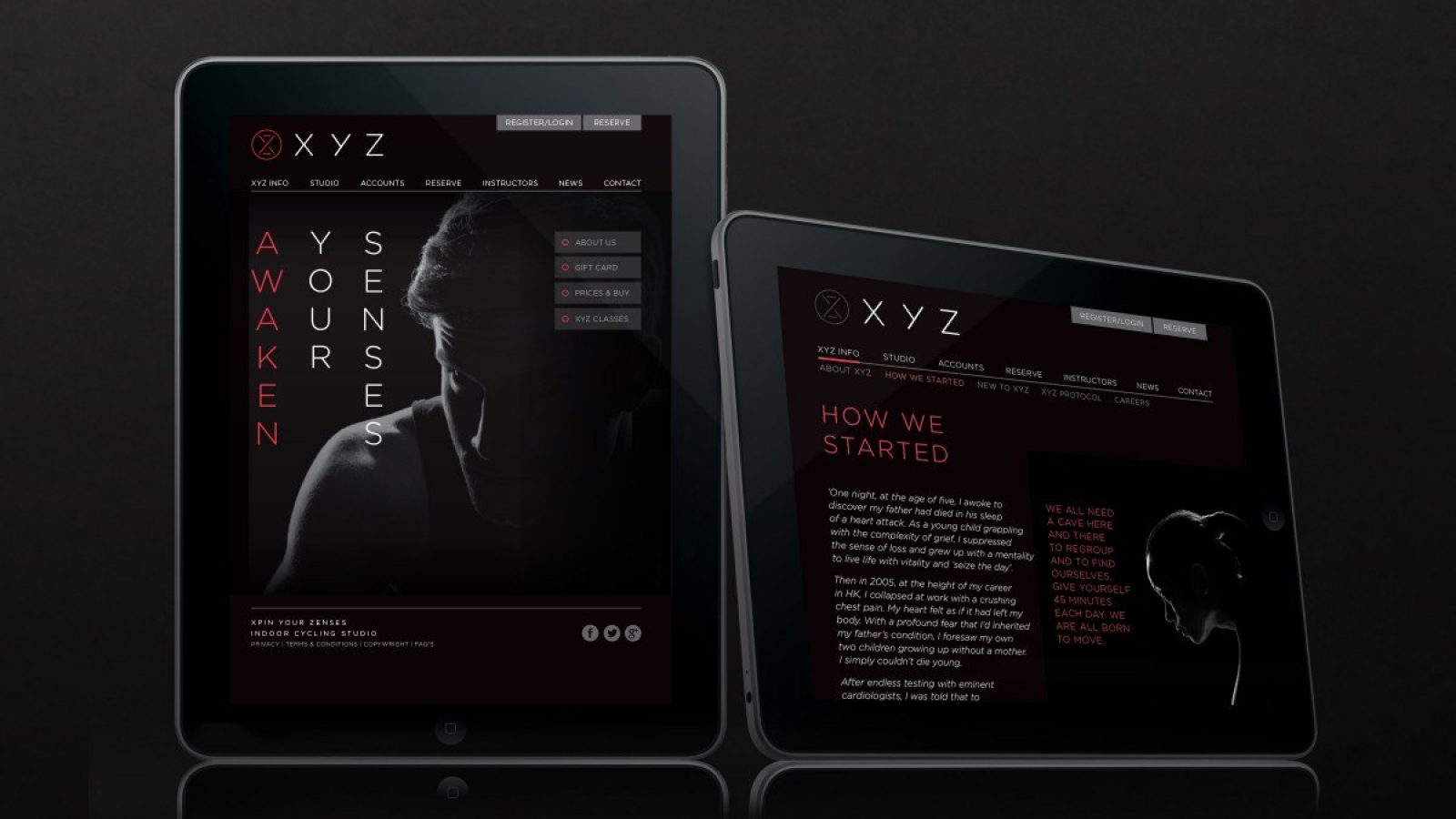
High end members clubs and karaoke bars are common post work destinations in Hong Kong, and so the visual style we’ve created had to compete in that arena whilst taking inspiration from Belinda’s idea of the cave. And the verbal identity (commissioned by us, created with writer Peter Kirby) is an evocative amplification of Belinda’s own tone of voice as she seeks to become a spokesperson for wellbeing in the city and beyond.
UEFA Youth League
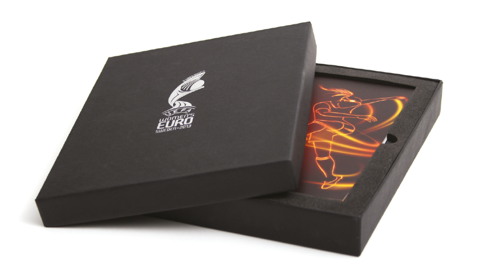
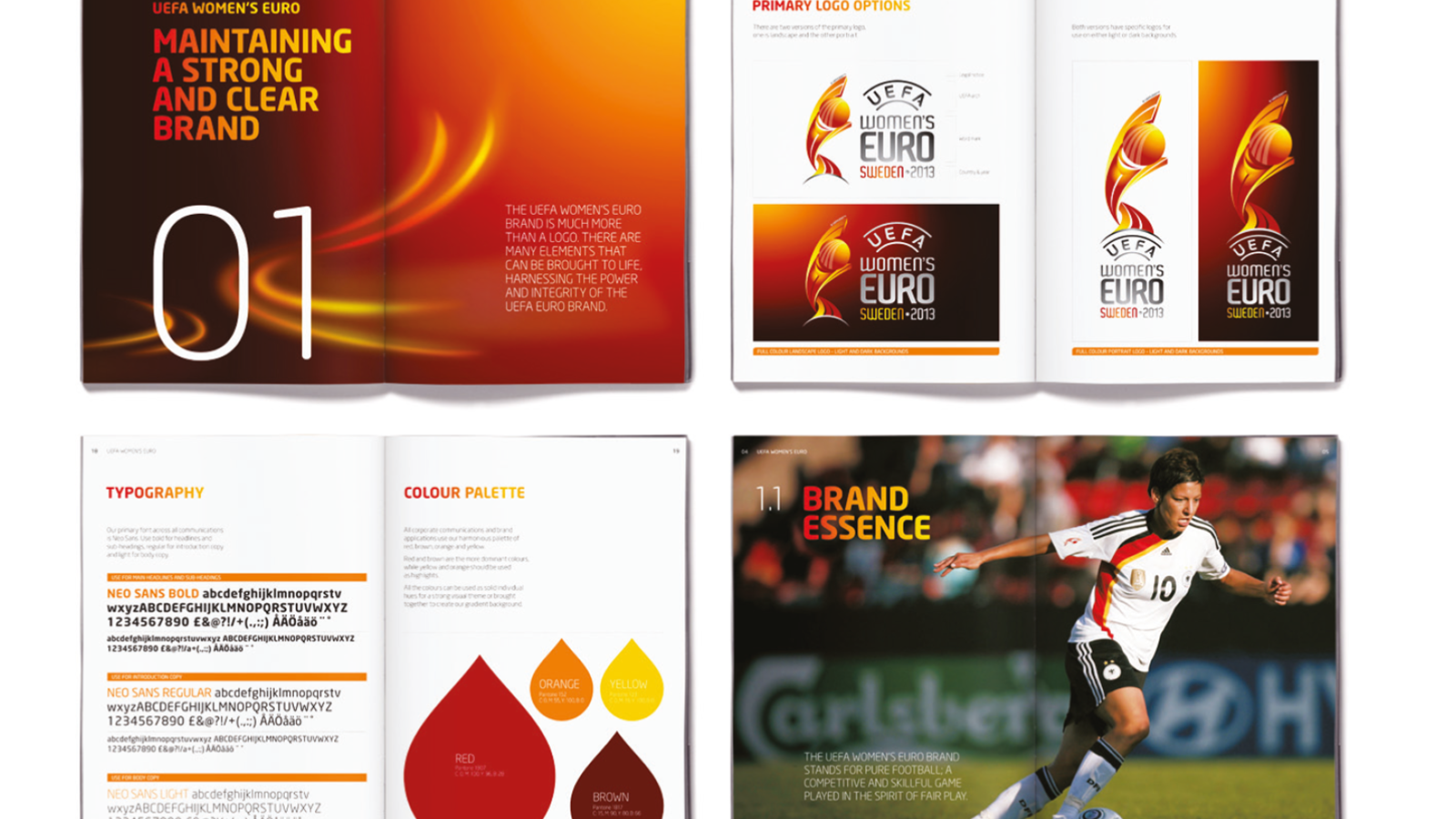
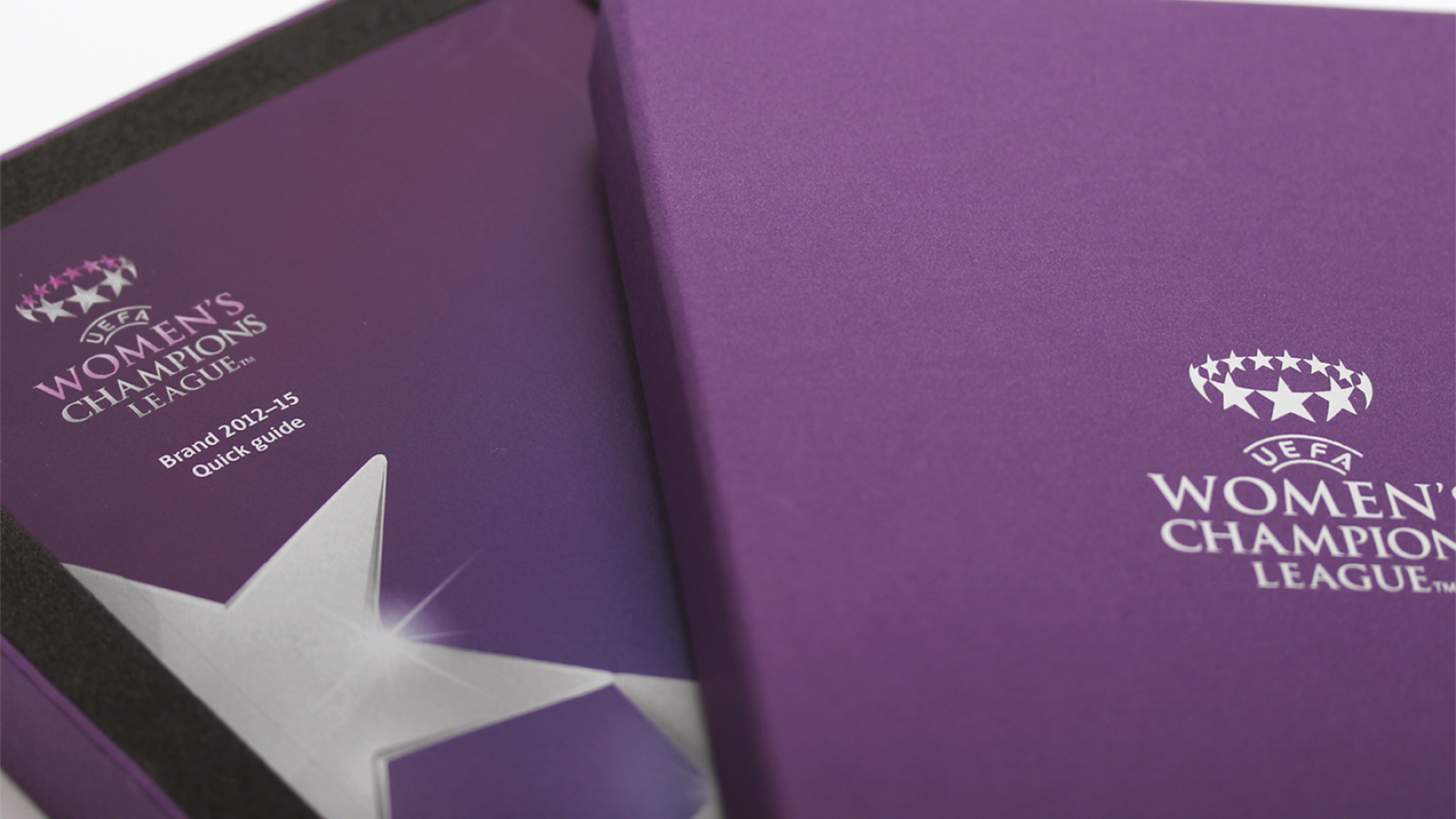
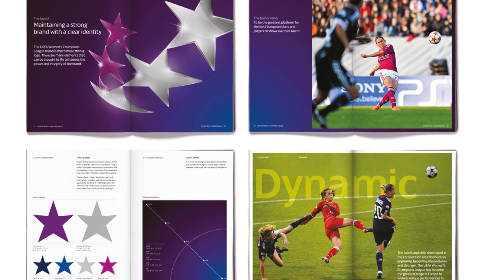
We had a long-standing relationship with UEFA, working on their core brand guidelines as well as developing the brands for both the Women’s Euro and the Women’s Champions League tournaments.
We were then invited to create the identity and trophy for the newly formed Youth League…
An object of desire for the best young footballers in Europe.
Bridging the gap
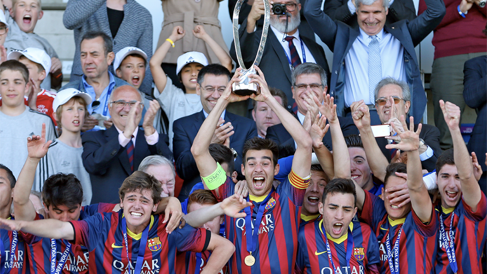
Launched in 2013, the UEFA Youth League is European football’s first major youth tournament at club level. It aims to reduce the distance between youth and first teams and offer unique international experience to young players. Each UEFA Champions League group stage club enters its Under-19 side in the annual competition.
From idea to symbol
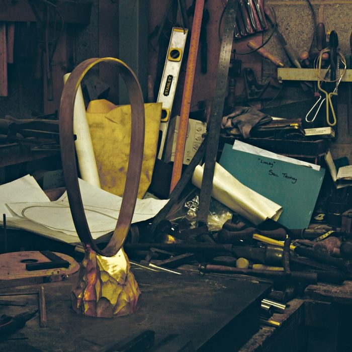
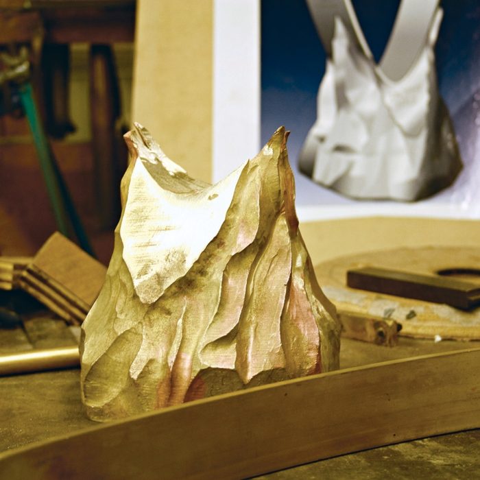
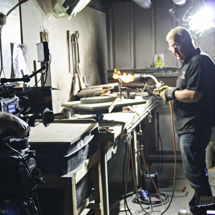
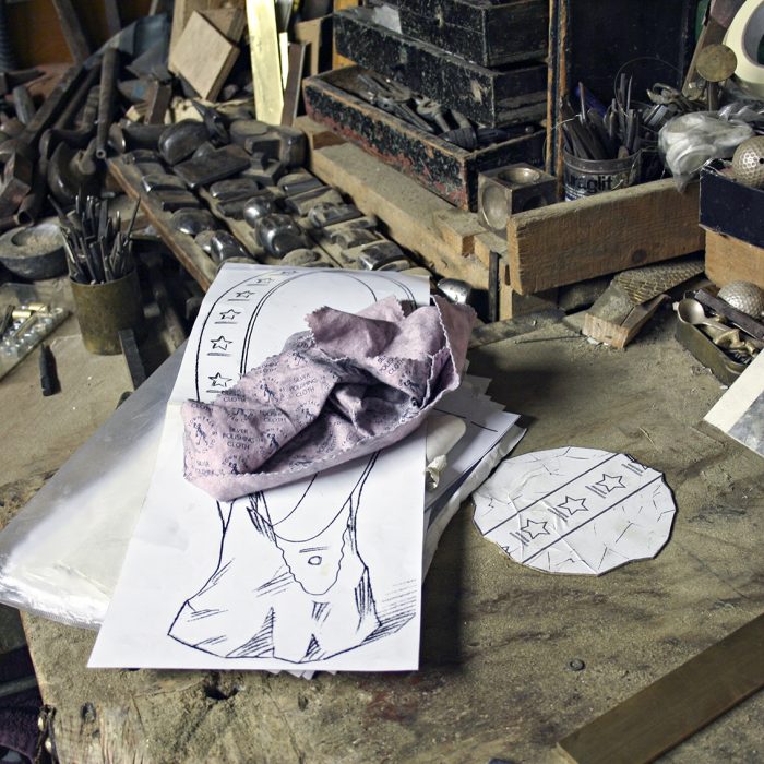
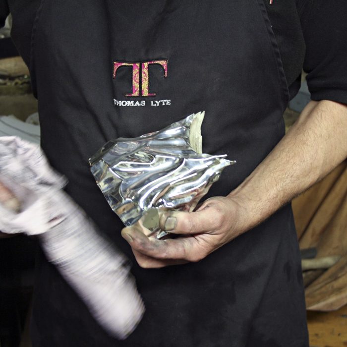
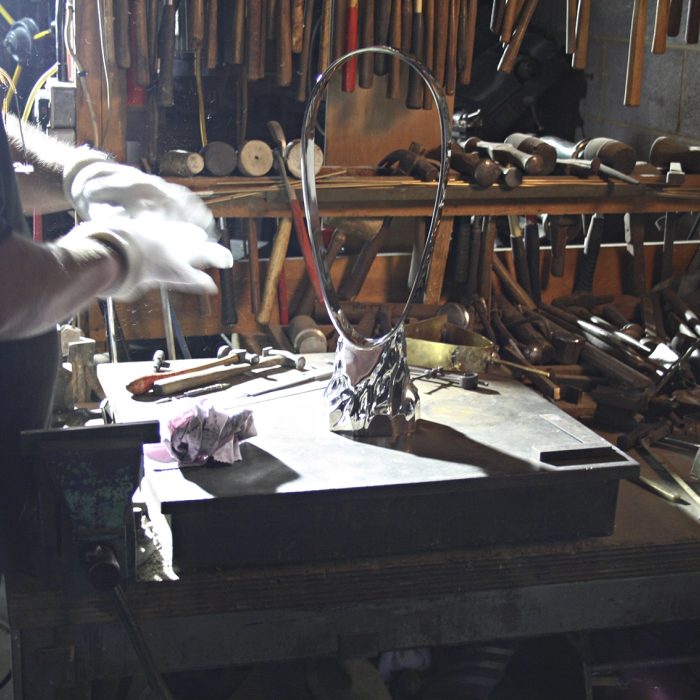
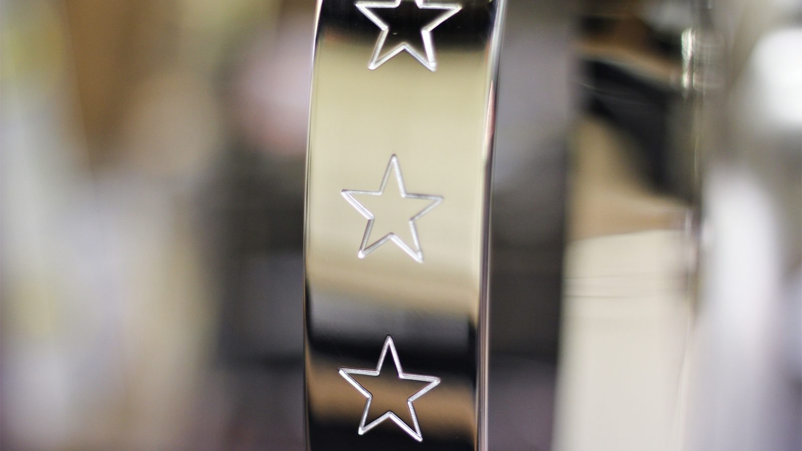
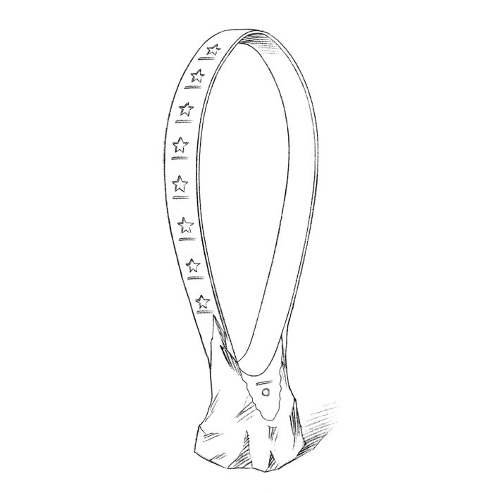
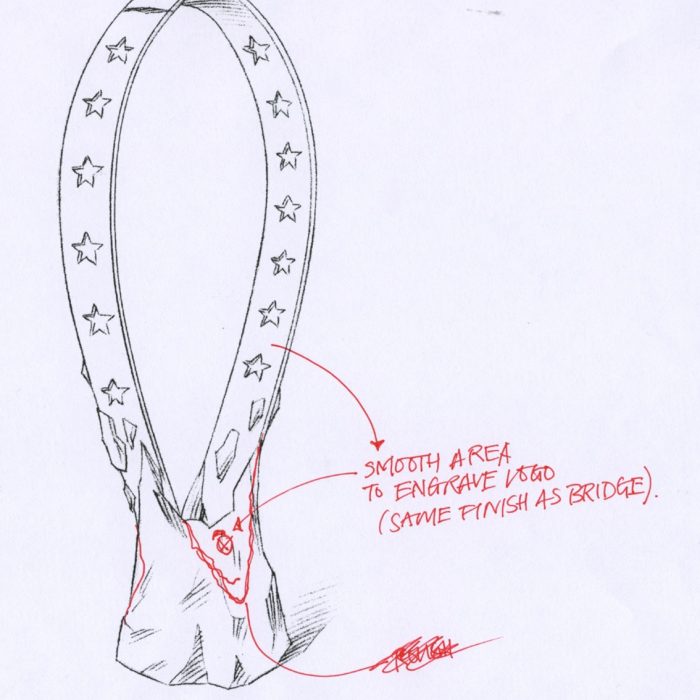
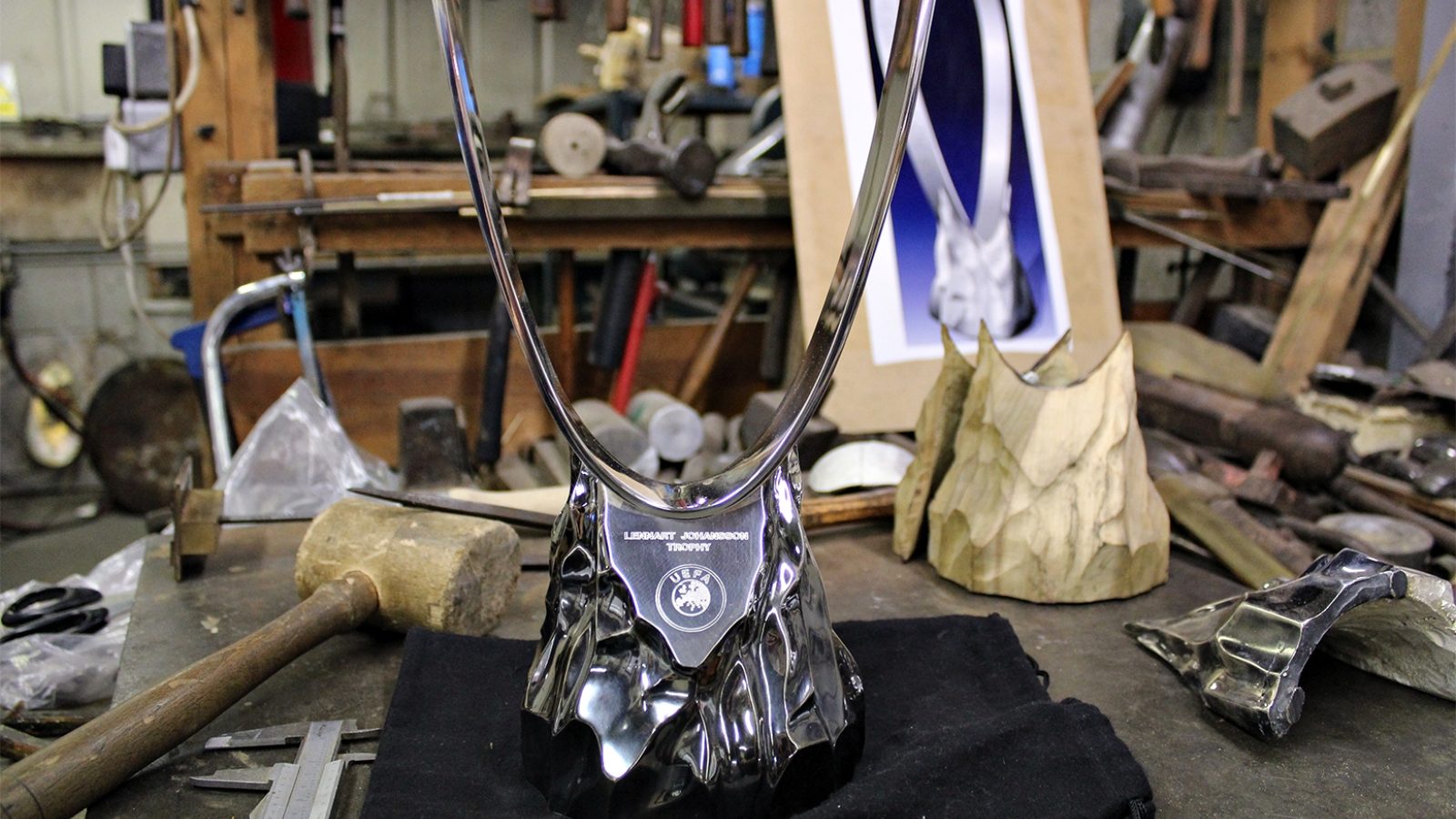
We worked with UEFA to develop the tournament’s brand positioning, wordmark design, trophy creation and launch film. The trophy, created in partnership with renowned silversmiths Thomas Lyte expresses the essence of the competition and symbolises the players’ progress on their journey from raw talents to polished professionals.
Getting the right result
For the film we wanted to capture the care and skill that had gone into crafting the trophy and show how that reflects the care and skill that goes into developing young players. So, together with production company The Armoury, we made a film that brings the two together. It was such a powerful expression of the two processes that UEFA chose to use the film at the launch of the trophy and on its website.
Ben & Jerry’s
Ben & Jerry & us
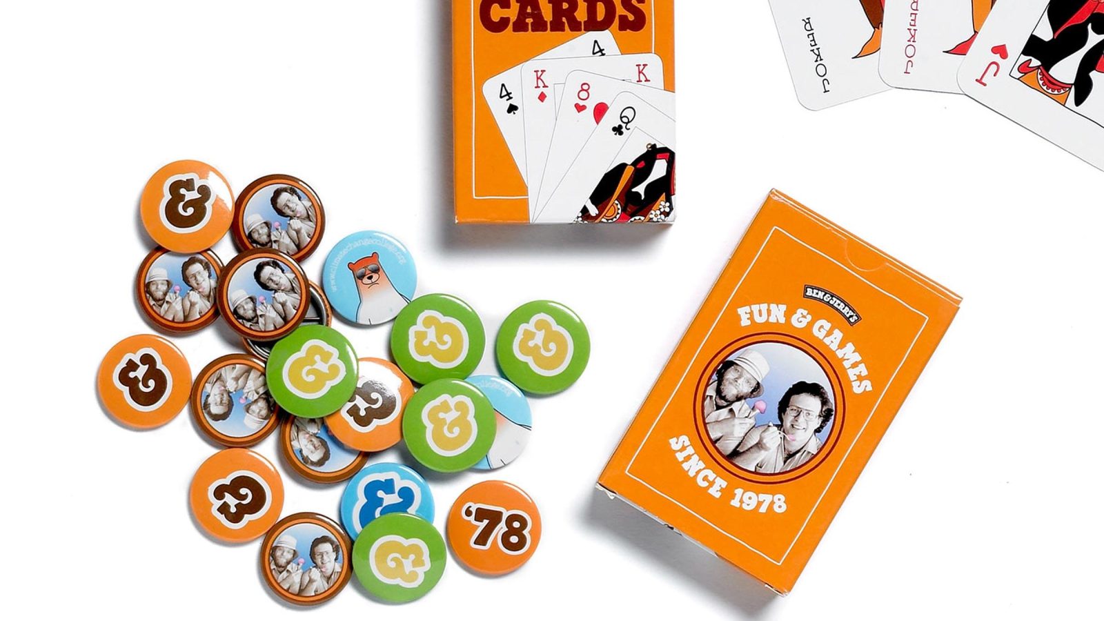
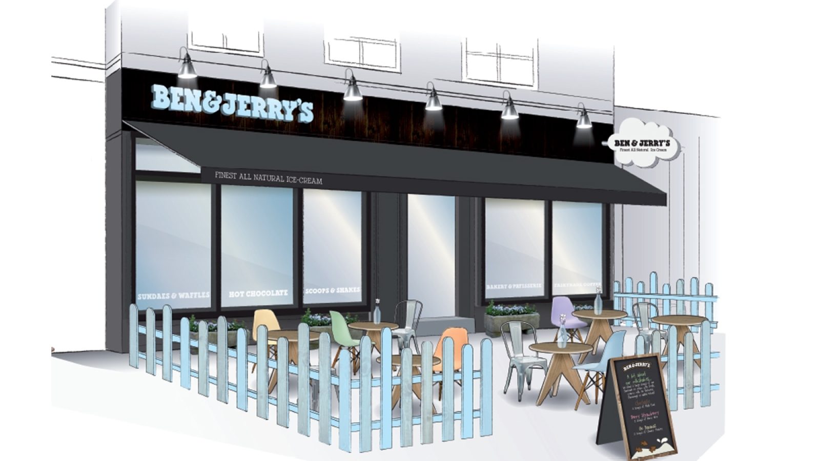
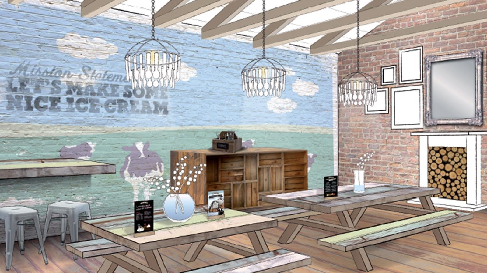
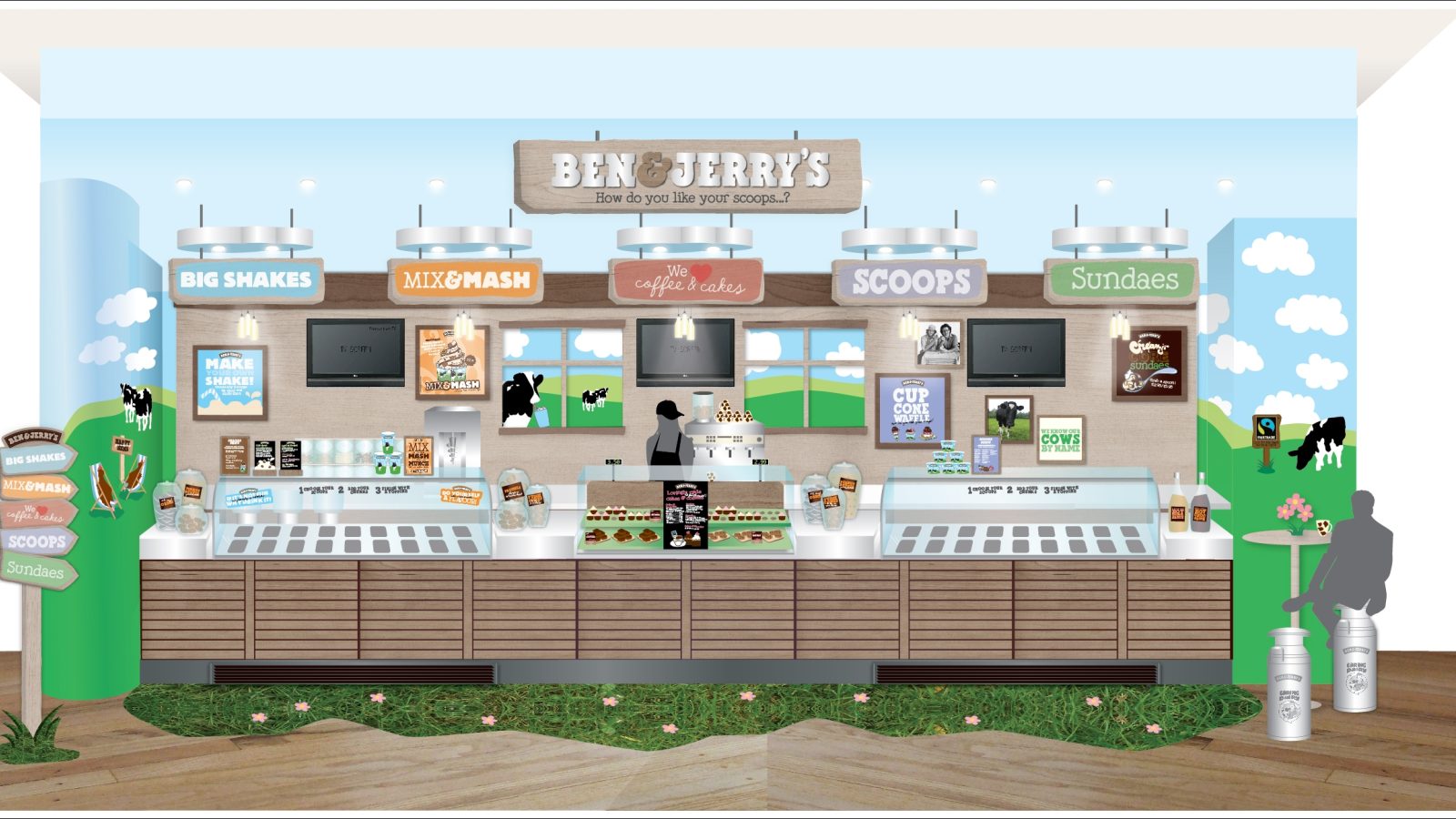
Ben & Jerry’s was one of our early clients, back at the beginning of Fivefootsix. Since then we’ve been involved in pretty much every aspect of the brand in Europe. As they’ve grown so have we. It’s an example of our philosophy that, when it comes to our clients, we’re bigger together.
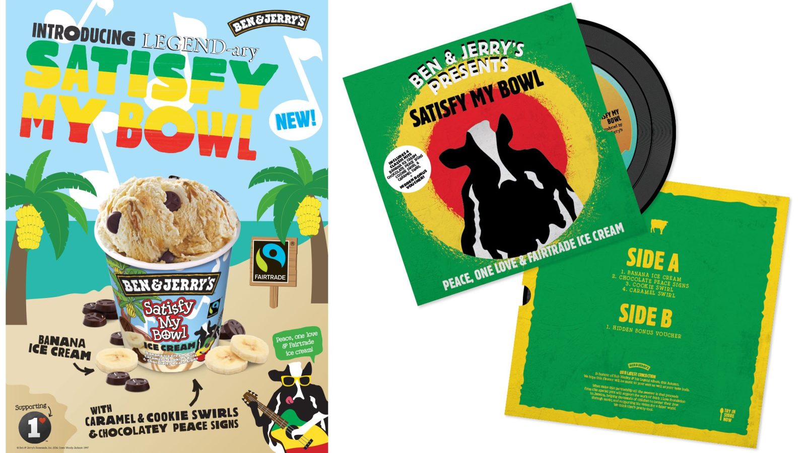
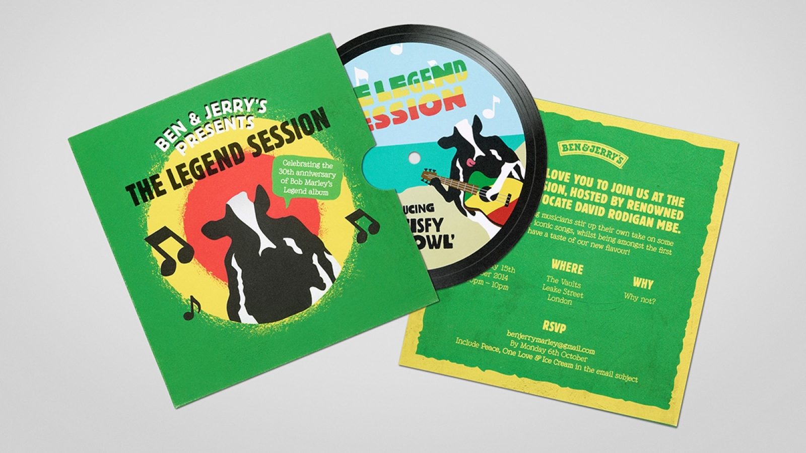
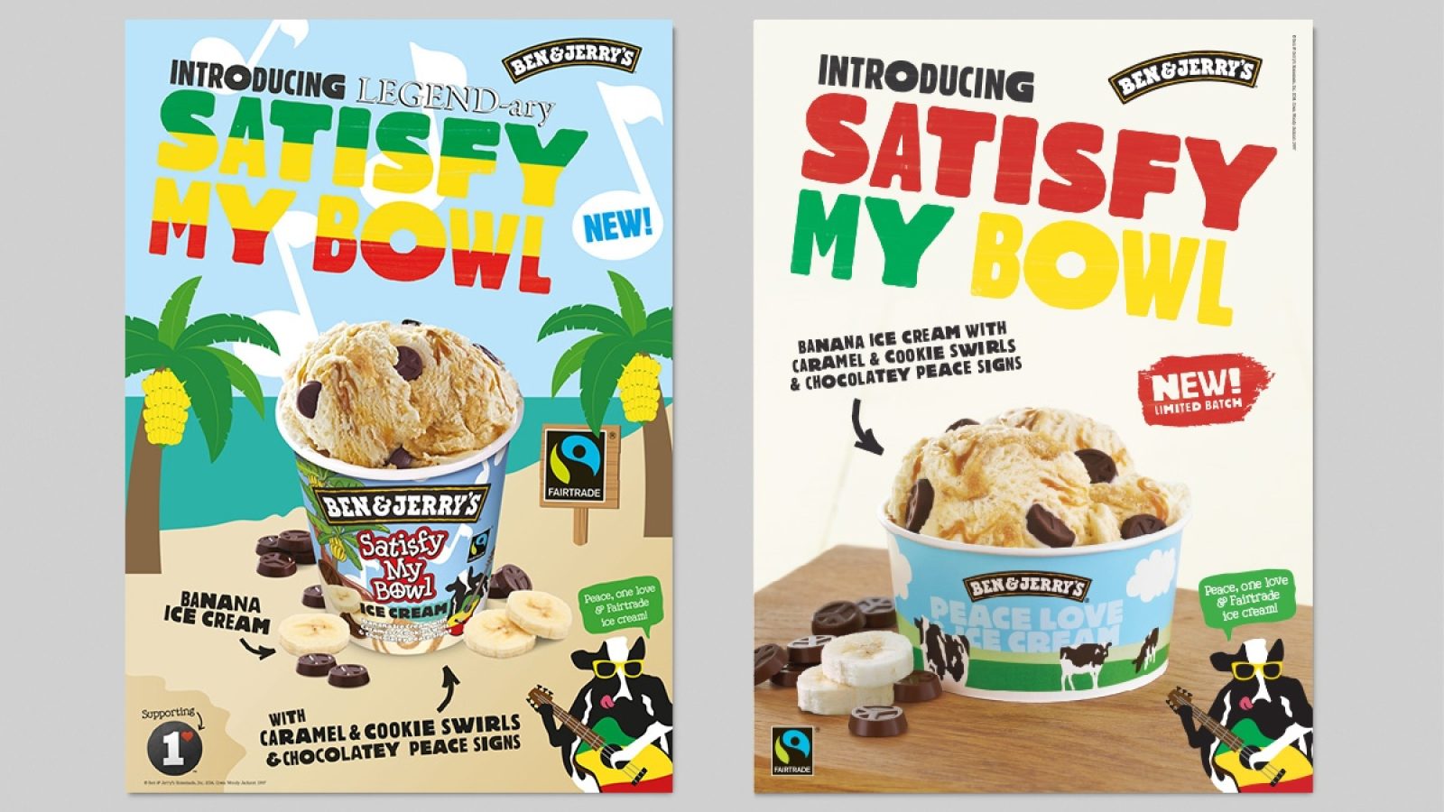
It’s a love thing
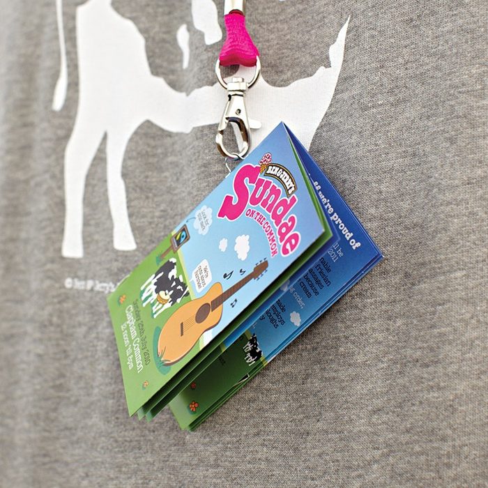
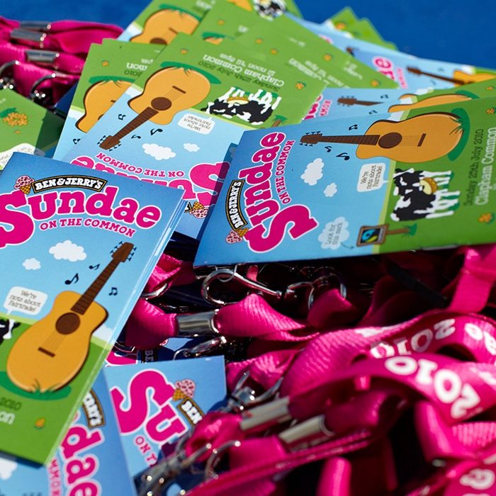
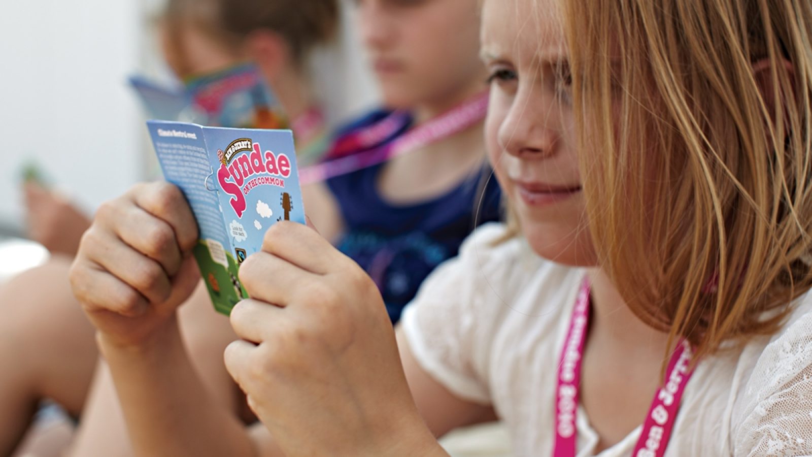
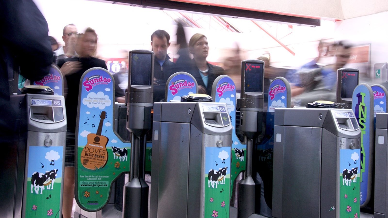
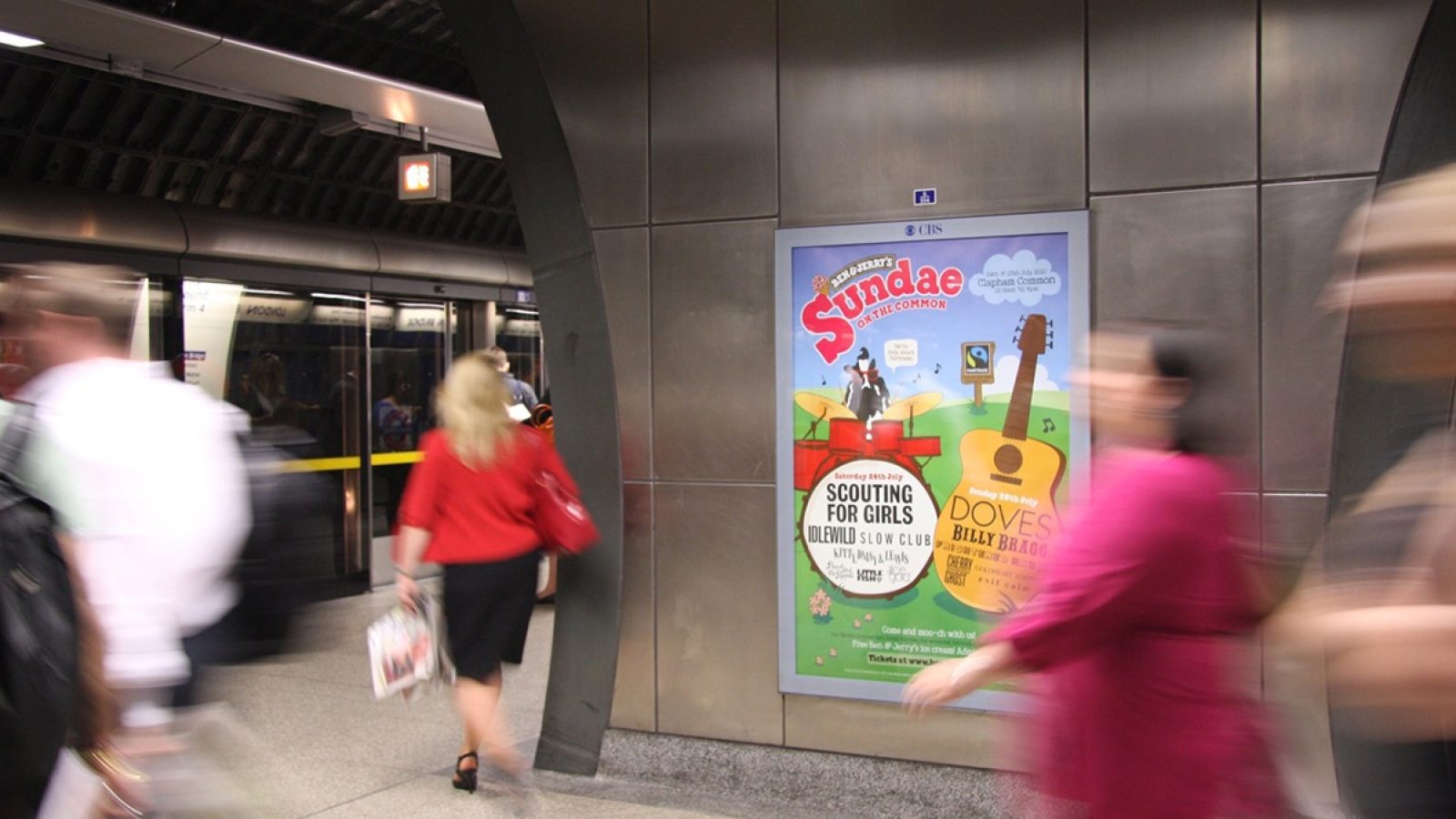
The key to our relationship is that the Ben & Jerry’s team know we truly understand and care about their brand. That’s why the work we do ranges from advertising concepts and point of sale to designing a festival and naming new products. We also create identities and design materials for corporate communications, as well as campaigns for their social mission initiatives.

Visual flavour
Our enduring relationship with the team means we know when and how to challenge them. For example, we felt their old product imagery didn’t live up to the fantastic product. So we worked with them to create a natural style of photography that reflects the natural ingredients that help make Ben & Jerry’s famous – and loved.
Movement for Modern Life
Why just create a website when you can start a movement?
Power (and suppleness) to the people!
In 2012 Yoga teacher and entrepreneur Kat Farrants wanted to find a new way to make yoga accessible for everyone. Her ambition was to take yoga into people’s homes via a subscription website offering the best in filmed yoga classes, with each session led by an expert. The proposition was clear: instead of having to fit your life around a yoga studio’s classes, the classes come to you – wherever you are, whenever you want.
Transforming an idea into a brand
Having met Kat early in the development of her idea, we helped her transform the project from a concept into a fully formed business with a powerful brand. She hadn’t launched a brand before, so we worked closely with her to explore and define target customers, proposition and personality.
Creating flexibility
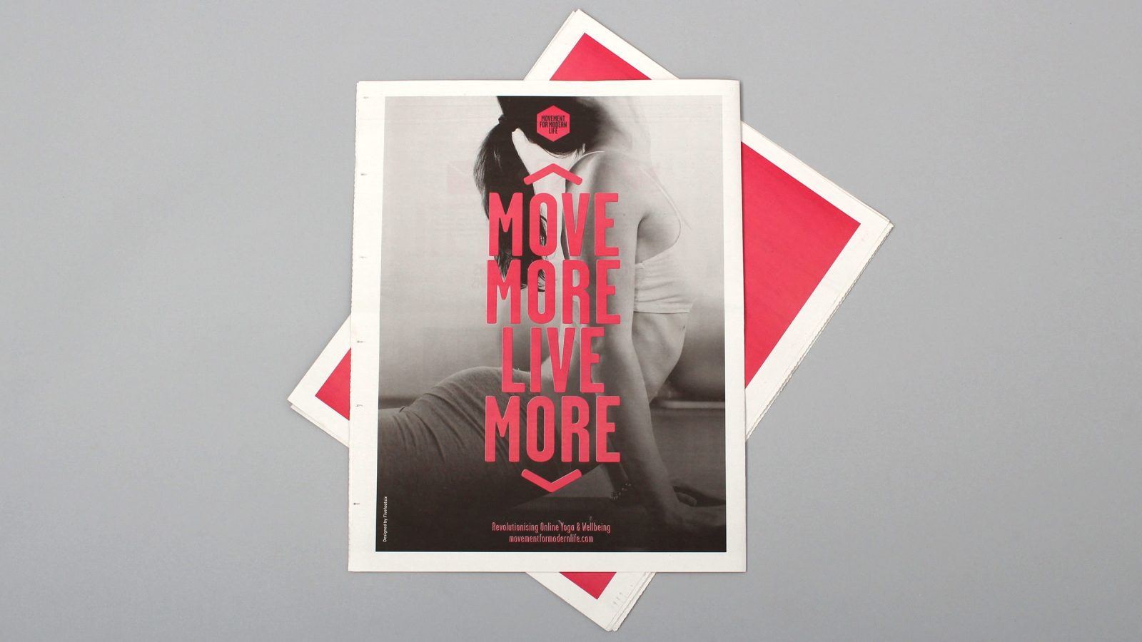
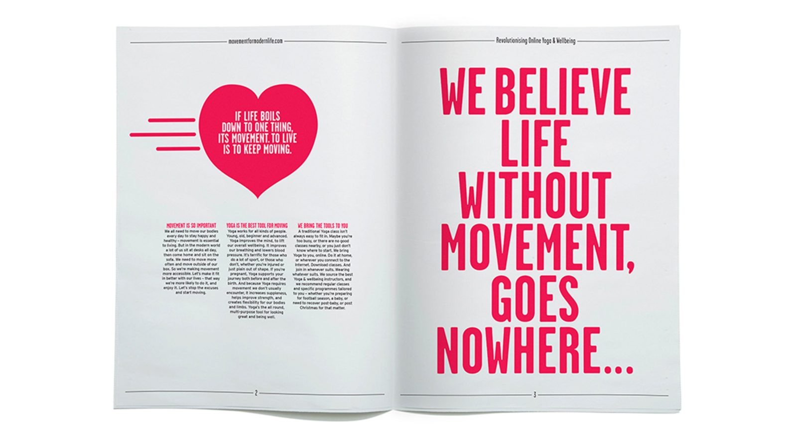
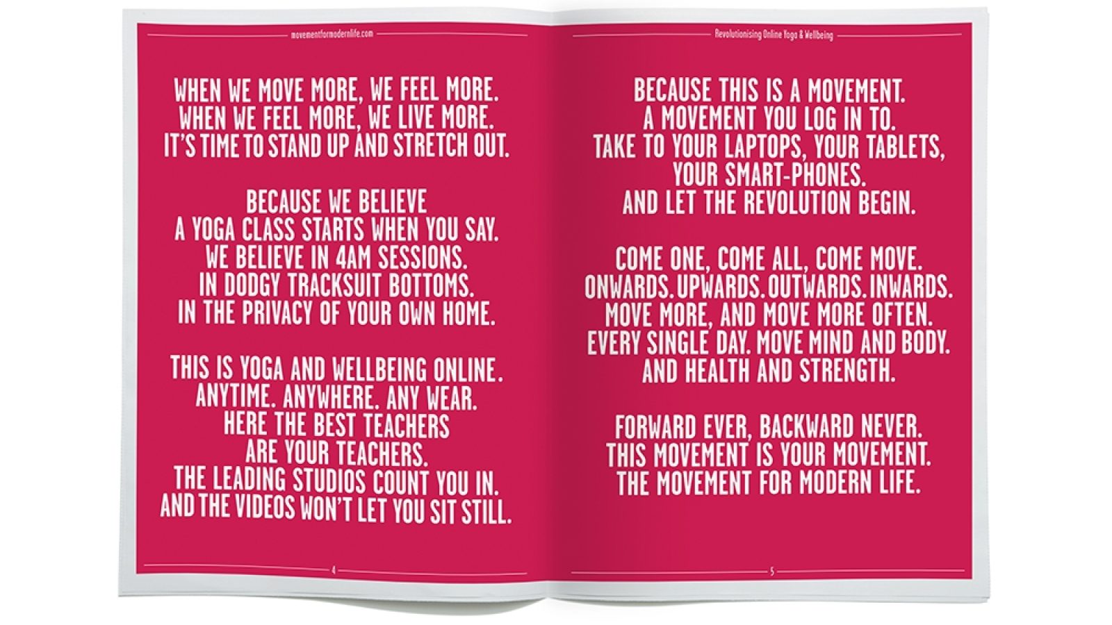
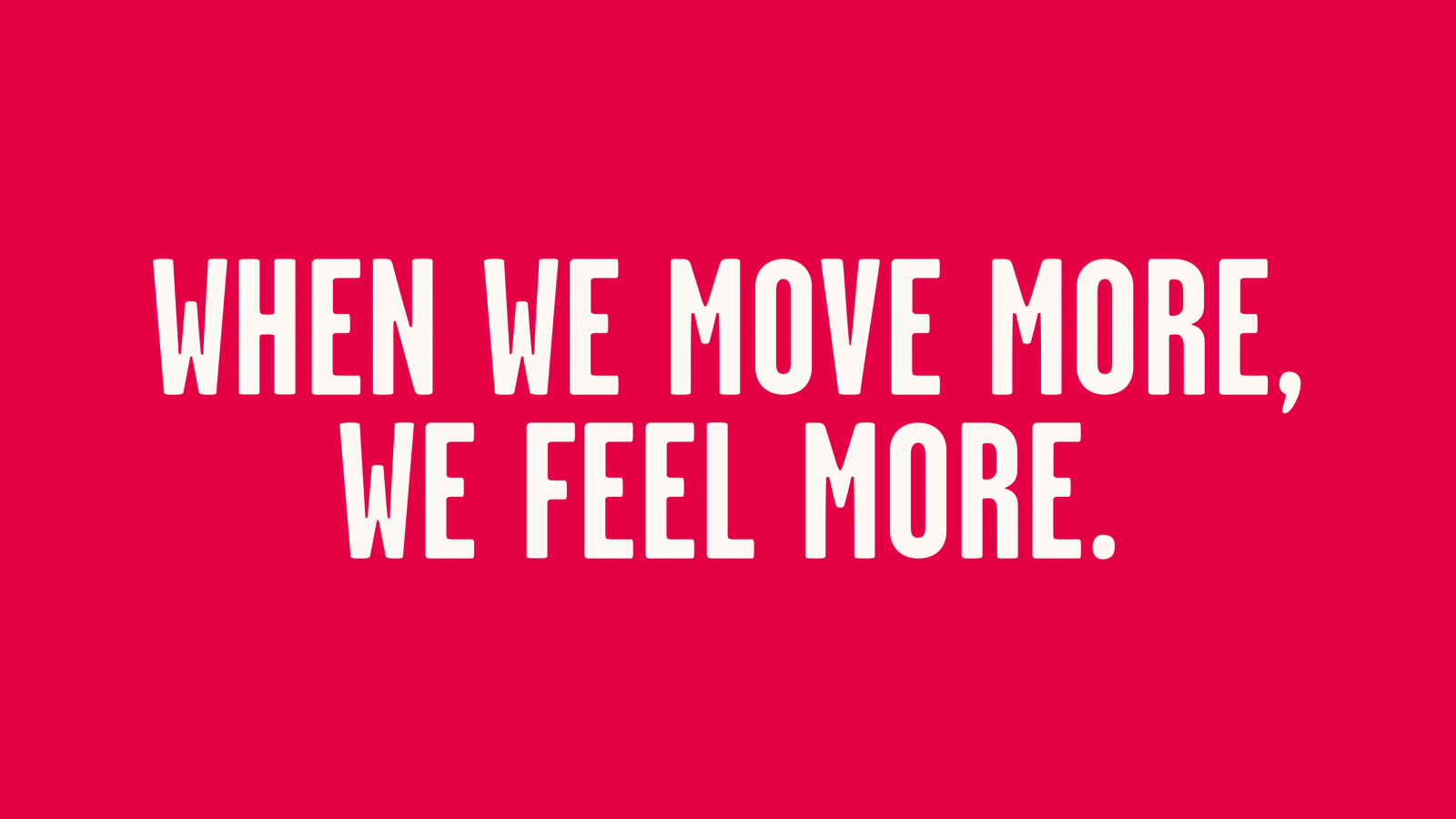
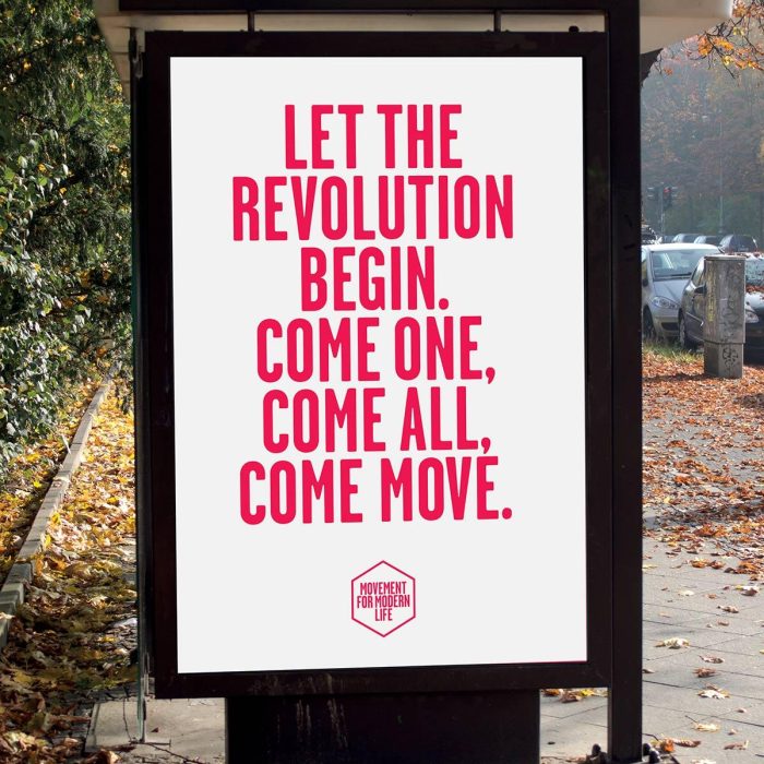
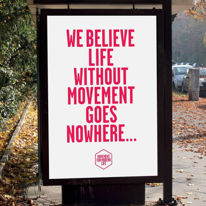
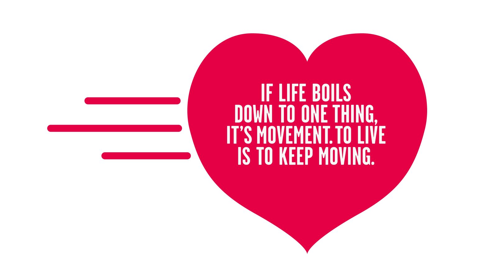
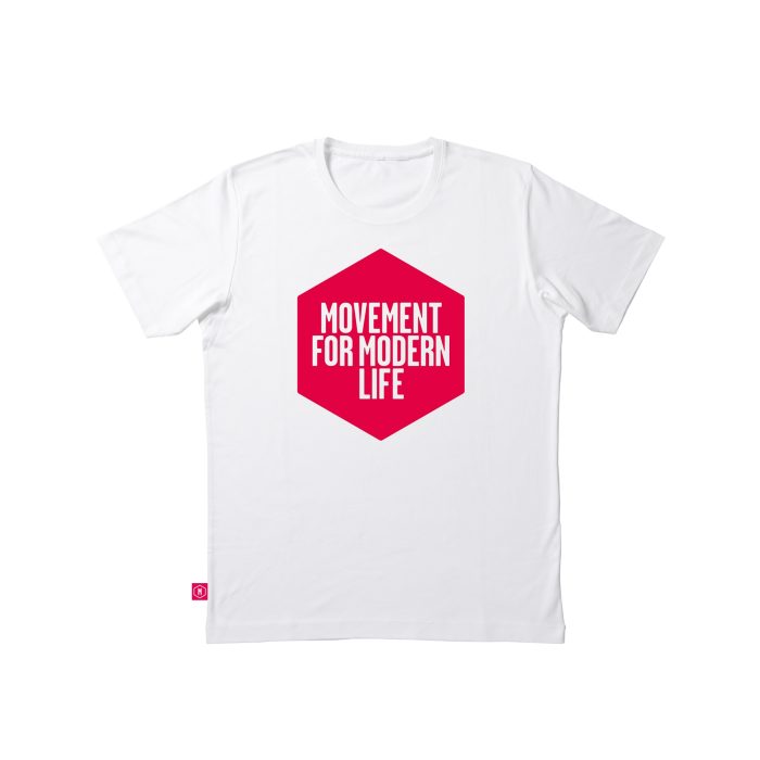
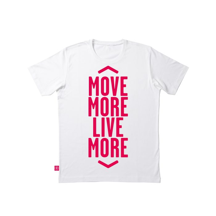
Keen to avoid the clichés so common in the yoga sector, we created a name, with copywriter Lisa Desforges, and an identity that had the spirit of a campaign enabling Kat to attract a core group of teachers and studios to bring her offer to life. And so Movement for Modern Life was born, complete with an inspiring manifesto developed with writer Jason Gormley. By talking about movement, rather than yoga, we differentiated the brand and gave it the flexibility to stretch beyond yoga in the future.
In the beginning, she didn’t yet have a website or subscribers. So like all good Movements, we created a lo-fi manifesto newsletter for her to distribute at yoga events to build up her tribe…
