300million
300million delivered brilliant answers to their clients' important brand questions.
Matt Baxter
Nigel Davies
Martin Lawless
The Body Shop
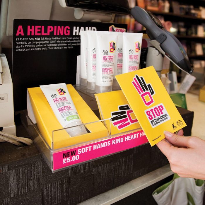
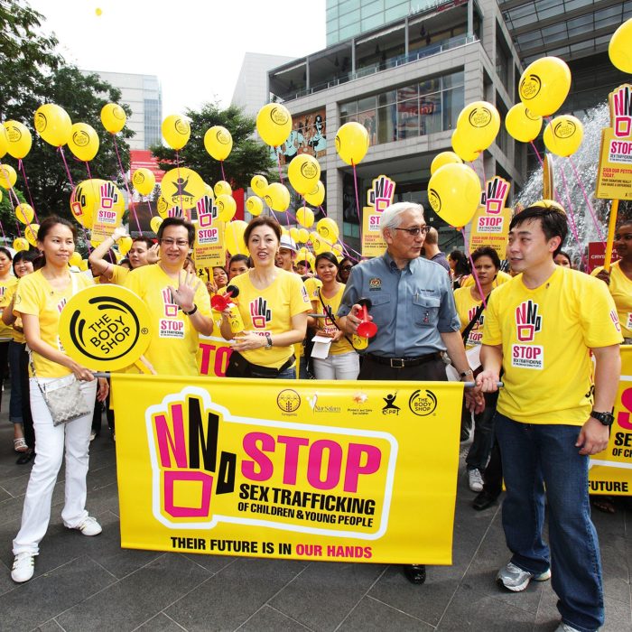
The ‘Stop sex trafficking of children and young people’ was the largest campaign in The Body Shop’s 36-year history, reinstating its authority in campaigning for change with a strong campaign brand identity.
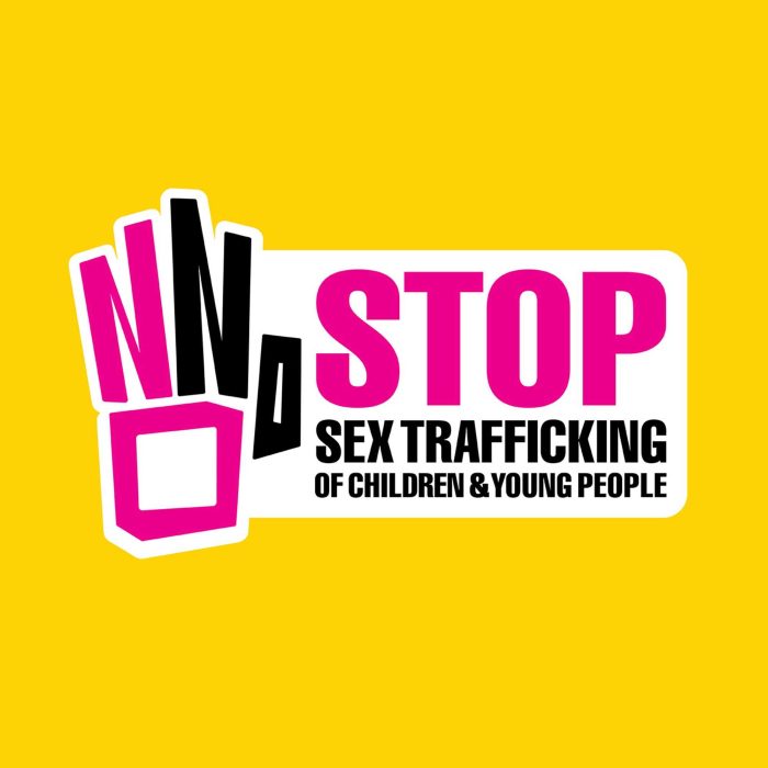
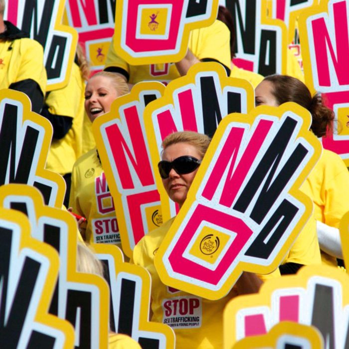
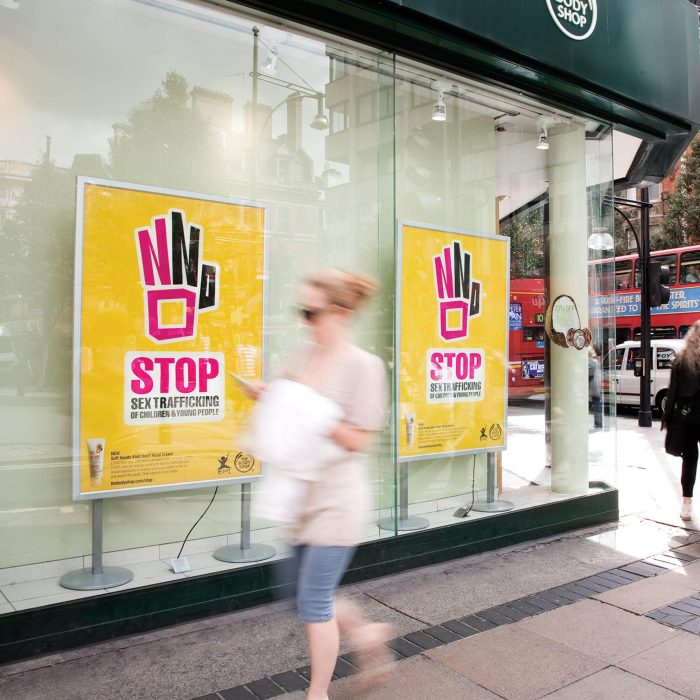
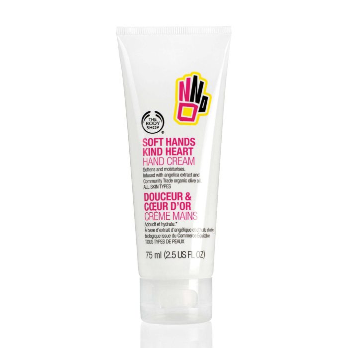
The groundbreaking campaigns for change by The Body Shop are legendary, but in recent years their campaigns had been less successful. That all changed with the launch of Stop Sex Trafficking of Children and Young People, a three year global partnership with NGO ECPAT, the international network of children’s rights organisations, that aims to put an end to the trafficking of children and young people for sexual purposes and change laws that enable this terrible global crime to thrive. A strong campaign brand, visual identity and campaignable ideas were designed by 300million to fund the campaign, drive petition signatures and help The Body Shop regain its authority in campaigning for change.
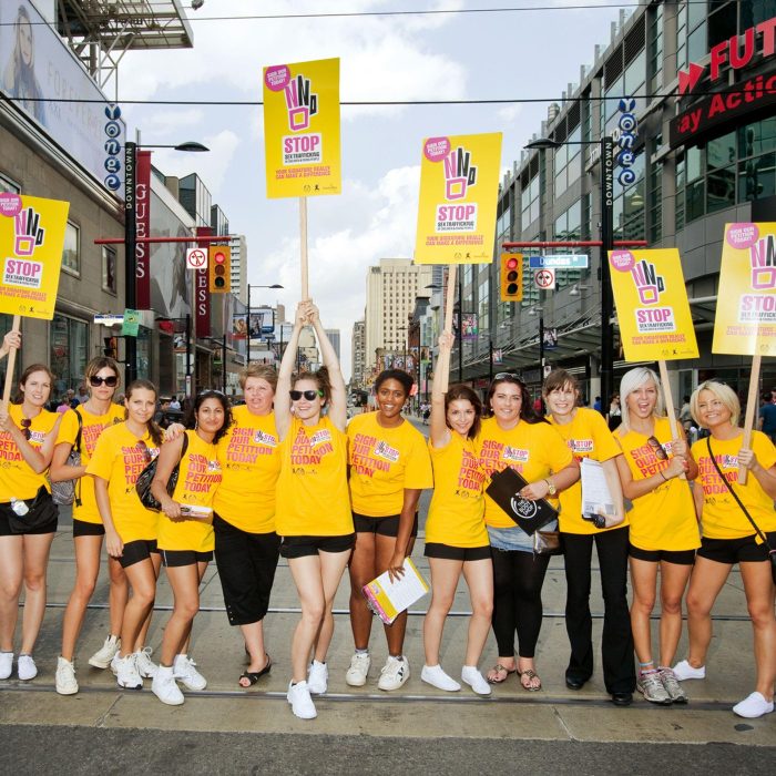
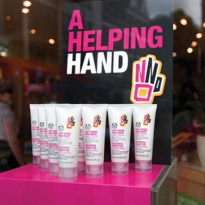
- Donations to ECPAT to fund the campaign exceeded objective by 200% after 9 months, generating just over £3 million in donations.
- 7 million signatures collected on petitions worldwide, surpassing the 6 million target by 15% and firmly enshrining this as The Body Shop’s biggest campaign ever.
- The largest ever human rights petition was presented to the EU commission in June 2011 with 15 countries handing their petitions to national governments, securing commitments beyond The Body Shop’s greatest hopes and expectations.
- 65 markets launched this campaign – more than any other campaign in The Body Shop’s history – further asserting this as The Body Shop’s biggest campaign ever.
“An exemplary approach to addressing a specific global challenge.”
Former US President Bill Clinton at The Clinton Global Initiative summit.
The Guild of Food Writers
Logo to help The Guild of Food Writers (he professional association of food writers and broadcasters in the UK) to appear more professional and authoritative in their sector.

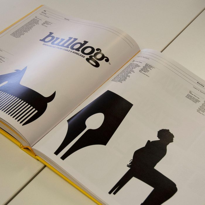
The Guild of Food Writers is the professional association of food writers and broadcasters in the UK. As well as supporting its industry, it campaigns for improvements in the awareness and quality of food in every sector of society. With the topicality of food increasing, 300million were asked to create a new logo to help make the GFW appear more professional and authoritative in their sector. Our simple, bold solution works well on-screen (their website is their key forum) and also has the added bonus of being economical to produce, as a one-colour monogram.
The logo quickly found its way around design blogs and forums. We loved all the kind words that started to come our way. It became the most creatively awarded logo design of the year. Judges loved it. And, the love has never really stopped since. In January 2011, it was recognised as one of the most loved logos of all time, nestled in between Coca-Cola and Volkswagen. It’s lovely how something so humble in comparison can rub shoulders with giants.
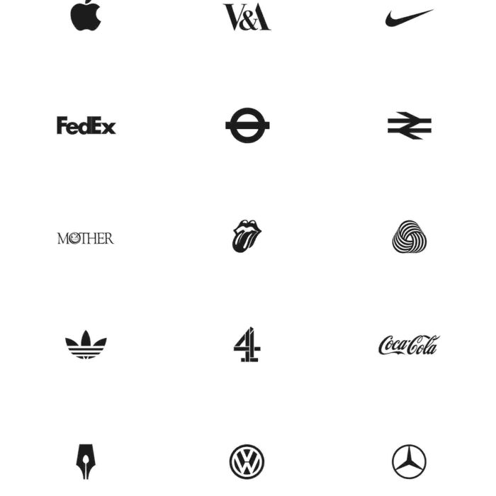
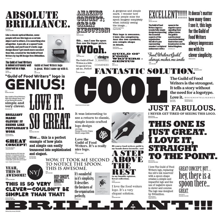
- The design has been very well received. In 2006, it became one of the most acknowledged logo designs in the world, being awarded by the Design Week Awards, D&AD Awards and it won a World Gold Medal at the prestigious New York Festivals.
Edinburgh International Film Festival
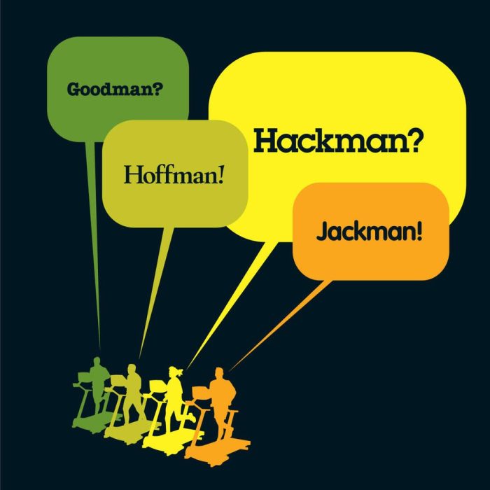
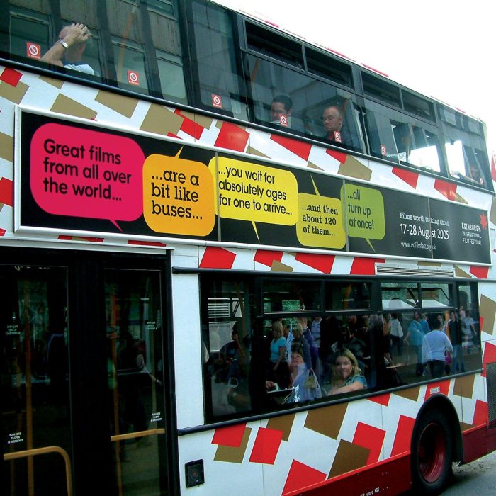
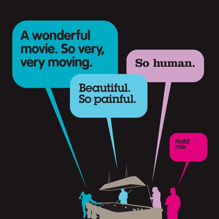
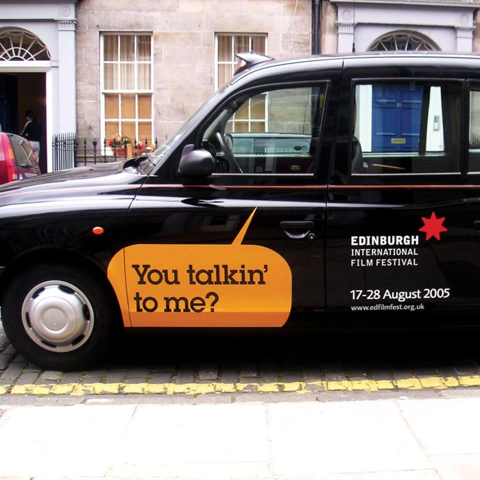
Campaign for the Edinburgh International Film Festival that could stretch across many media, including print, exhibition and cinema advertising whilst having dramatic standout in a highly competitive environment.
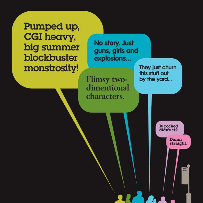
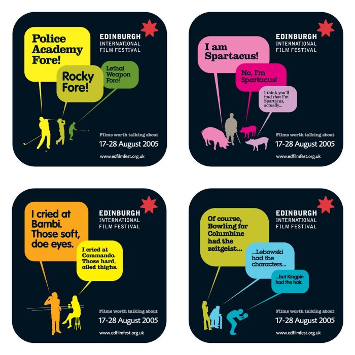
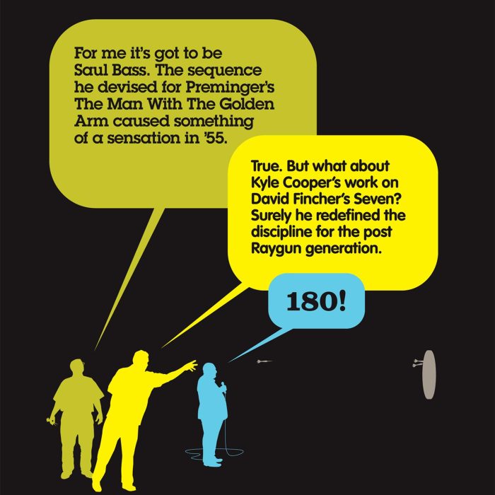
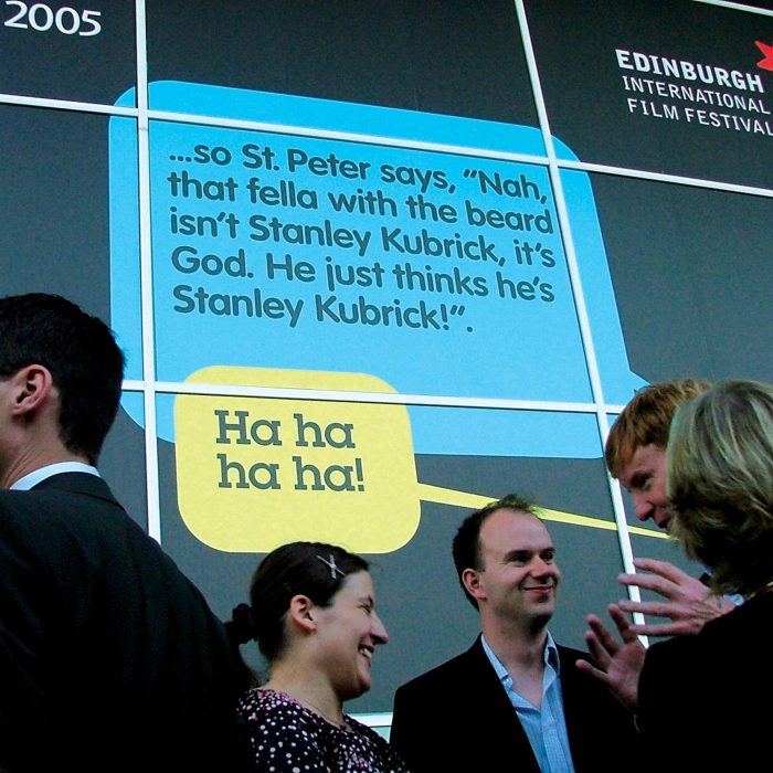
The Edinburgh International Film Festival (EIFF) is the longest running film festival in the world (over 60 years) and is widely regarded as the UK’s leading cinematic event and a major part of the annual
300million were appointed to create the entire through-theline campaign for the festival for two years. The major challenge was to create a campaign that could stretch across many media, including print, exhibition and cinema advertising whilst having dramatic standout in a highly competitive environment.
Yota
A creative partner to the world’s first 4G high speed wireless mobile broadband network, providing ideas, tools and inspiration over a 3 year relationship.

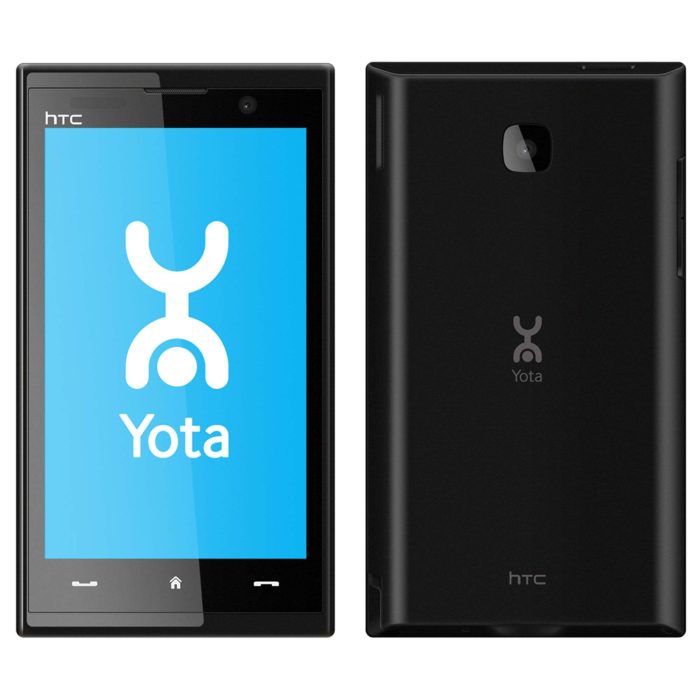
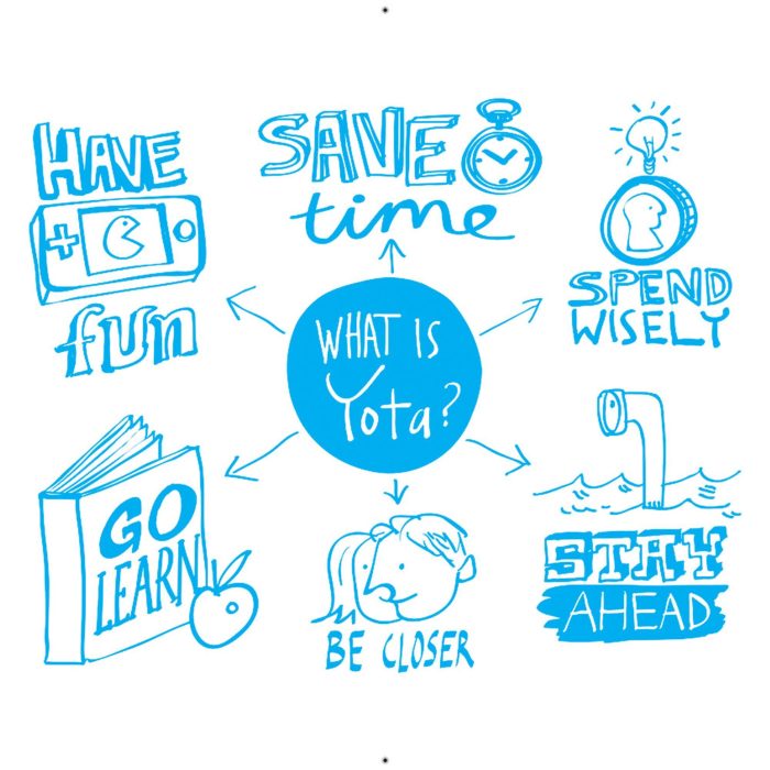
Yota was the world’s first 4G high speed wireless mobile broadband network, allowing instant ‘on the go’ internet access anywhere within its networks.
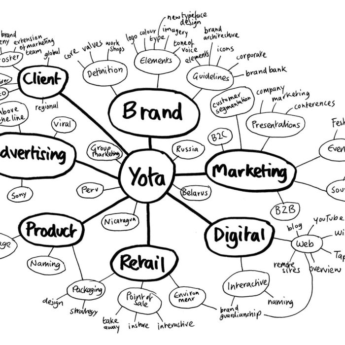
Originally launched in several Russian cities, Yota also now operated in Belarus, Peru and Nicaragua. Understanding that the future of mobile telephony income is in licensed content as traditional income from voice and SMS becomes obsolete through web-based mobile platforms, Yota also offered its customers access to online music, TV, films, books, photo sharing services and VoIP.
The partnership with Yota lasted three years. They wanted a true creative partner that was nimble enough to help on their ongoing and ever-changing brand journey, an agency who could provide , not just take them to a final destination.
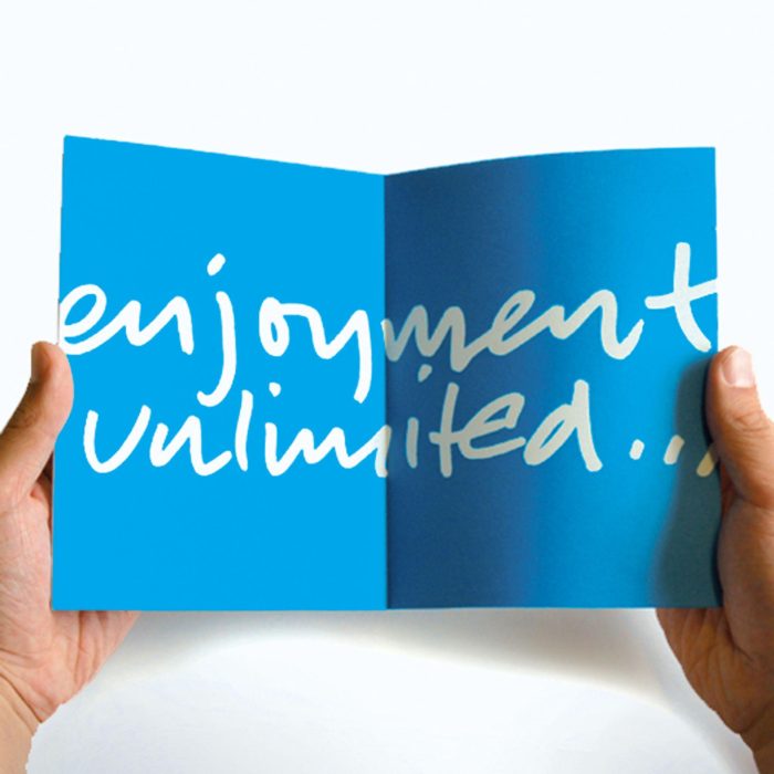
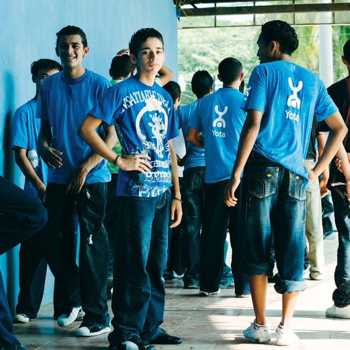
In just three years, Yota grew from being a start-up company to become a leading visionary in the telecoms sector:
- Operational break-even point achieved less than fi ve months after the network’s commercial operations began.
- Corporate customer subscriptions increased by 62% after the fi rst month of trading. 600,000 customers, half-year results of $66million and 80% market awareness in Russia just 14 months post launch.
- In March 2011, Yota announced a deal with rival Russian networks Beeline, Megafon, MTS and Rostelekom to roll out its 4G system across the country’s 180 cities, making it available to more than 70 million people by 2014.
- Yota Space received over 500 pieces of press coverage – that’s more international media coverage the Moscow International Film Festival, which is now in its 33rd year.

- Google Russia Awards 2009: Winner for Most Searched For Brand in Russia. 3rd most wanted Russian employer (according to website headhunters)
- Global Telecoms Business Innovation Awards 2009: Winner in International Consumer Services Innovation category for the MAX 4G mobile device in partnership with Microsoft.
- Global Mobile Awards 2009: Finalist for Best Mobile Television Service category.
Crisis
Visual identity to reinforce Crisis’ core belief “focus on the individual’ making the charity’s attention-demanding name a distinctive logo that positively drips disruption and defiance.
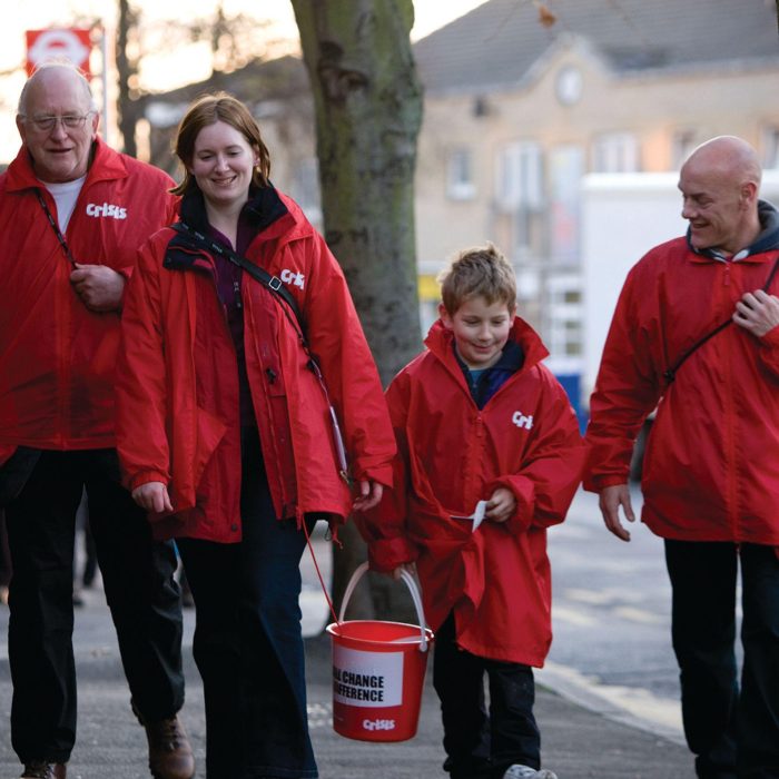
Best known for its annual Christmas Appeal, Crisis is a high-profile UK national charity that fights homelessness and empowers homeless people to transform their lives. Like other leading charities, Crisis has adopted a far more professional approach to fundraising and lobbying in recent years. The risk with this is that the brand begins to behave and communicate in a rather more ‘corporate’ style. So how could Crisis ensure its brand continued to embody the nimble, defiant, instinctively risk-taking ethos that defined the charity in the first place?
We helped Crisis refine its single core belief which serves as the foundation for all the creative execution: a commitment to focusing on the individual, and to a radical and disruptive approach to achieving its objectives.
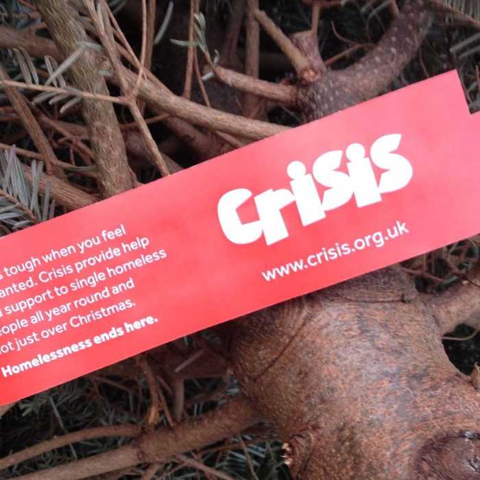
A new visual identity reflects and reinforce Crisis’ core belief. Most notable, the charity’s attention-demanding name is now a distinctive logo that positively drips disruption and defiance. New imagery, tone of voice and a simple and bold approach to layout and colour help to retain a feeling of individualism, while recognising the importance of the collective responsibility for ending homelessness.
Brand communications guidelines make things easy – all agencies have been able to deliver better campaigns and argue the case for change in a way that is persuasively professional, yet without pulling any punches.
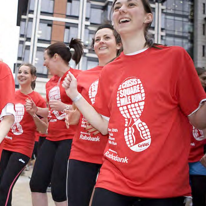
An easily understood idea, powerfully and consistently expressed, can play a hugely valuable role in the growth and development of an organisation. With a five-year plan now in place, and the brand foundations firmly established, Crisis is expanding its operations nationwide – as well as making an impact with cultural events like the Crisis Hidden Gigs.
"As we developed our plans for the future, it became clear that we needed a new brand identity. Our new brand is positive and energetic, provides us with a platform for high-impact campaigns and, most importantly, reflects how homeless people want to be seen and heard.”
Leslie Morphy, Chief Executive, Crisis
